
UX Research & UI Redesign
UX Research & UI Redesign
6 minutes read
6 minutes read
WEALTHSIMPLE APP REDESIGN.
WEALTHSIMPLE APP REDESIGN.
WEALTHSIMPLE APP REDESIGN.
How might we make the daunting experience of investing which is generally a "grown-up job" so intuitive and simple to understand with complete transparency about the user's profits and/or losses that it completely "dumbs down" the process and makes investing feel like a breeze!
95% of all traders lose money in the market. The Onus is on the Intermediary to Educate the investors.
Traders being people trading futures, options, swing trading etc. Why is the onus on the intermediary? Simple rule of business, if the end retail investor is educated and aware, they would try to make an informed decision while investing which would reap more returns, which potentially means that they would reinvest their gains, thereby more brokerage and exchange fees for Wealthsimple. Alternatively, if someone with limited capital loses all of their investment because they weren’t educated properly by the platform, they’d believe that investing is as good as gambling and might never invest again.
How might we make the daunting experience of investing which is generally a "grown-up job" so intuitive and simple to understand with complete transparency about the user's profits and/or losses that it completely "dumbs down" the process and makes investing feel like a breeze!
95% of all traders lose money in the market. The Onus is on the Intermediary to Educate the investors.
Traders being people trading futures, options, swing trading etc. Why is the onus on the intermediary? Simple rule of business, if the end retail investor is educated and aware, they would try to make an informed decision while investing which would reap more returns, which potentially means that they would reinvest their gains, thereby more brokerage and exchange fees for Wealthsimple. Alternatively, if someone with limited capital loses all of their investment because they weren’t educated properly by the platform, they’d believe that investing is as good as gambling and might never invest again.
Client :
Client :
Wealthsimple
Wealthsimple
Year :
Year :
2025
2025
Industry :
Industry :
FinTech
FinTech
Project Duration :
Project Duration :
8 weeks
8 weeks
What Exactly Is The Problem?
What Exactly Is The Problem?
Hypotheses.
Hypotheses.
Hypotheses.
Optimizing the onboarding experience for users who have recently opened a new TFSA account by integrating guided walkthroughs, enhancing user control and freedom in watchlist creation, and providing clearer profit/loss insights with basic stock analysis tools. This will create a more intuitive and empowering user experience resulting in increased user engagement, retention, and satisfaction, ultimately driving higher adoption rates by investors from competing platforms. This will not only increase the current user retention rate but also increase the customer base, thereby generating more profit.
Optimizing the onboarding experience for users who have recently opened a new TFSA account by integrating guided walkthroughs, enhancing user control and freedom in watchlist creation, and providing clearer profit/loss insights with basic stock analysis tools. This will create a more intuitive and empowering user experience resulting in increased user engagement, retention, and satisfaction, ultimately driving higher adoption rates by investors from competing platforms. This will not only increase the current user retention rate but also increase the customer base, thereby generating more profit.
jargon soup
1st Iteration
In simpler terms, the user should be able to easily complete the following tasks (JTBD):
In simpler terms, the user should be able to easily complete the following tasks (JTBD):
See their *remaining* TFSA contribution limit.
See their *remaining* TFSA contribution limit.
See their *remaining* TFSA contribution limit.
Track their potential investments easily and intuitively AKA multiple watchlists creation.
Track their potential investments easily and intuitively AKA multiple watchlists creation.
Track their potential investments easily and intuitively AKA multiple watchlists creation.
Easily understand their P&L (in absolute $ and % value) under holdings.
Easily understand their P&L (in absolute $ and % value) under holdings.
Easily understand their P&L (in absolute $ and % value) under holdings.
Do basic stock analyses for different symbols to make an informed decision.
Do basic stock analyses for different symbols to make an informed decision.
Do basic stock analyses for different symbols to make an informed decision.
Intro To Problem
Intro To Problem
Intro To Problem

#3
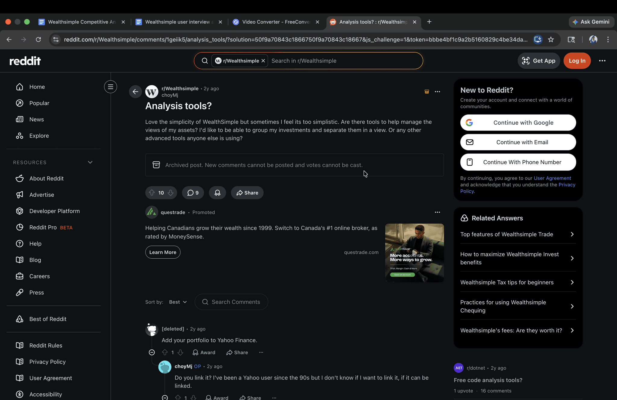
Cannot create multiple custom watchlists. For example, you can’t create one watchlist for “Tech” stocks and another for “Healthcare” stocks.
Cannot create multiple custom watchlists. For example, you can’t create one watchlist for “Tech” stocks and another for “Healthcare” stocks.
Secondary Research Backing -
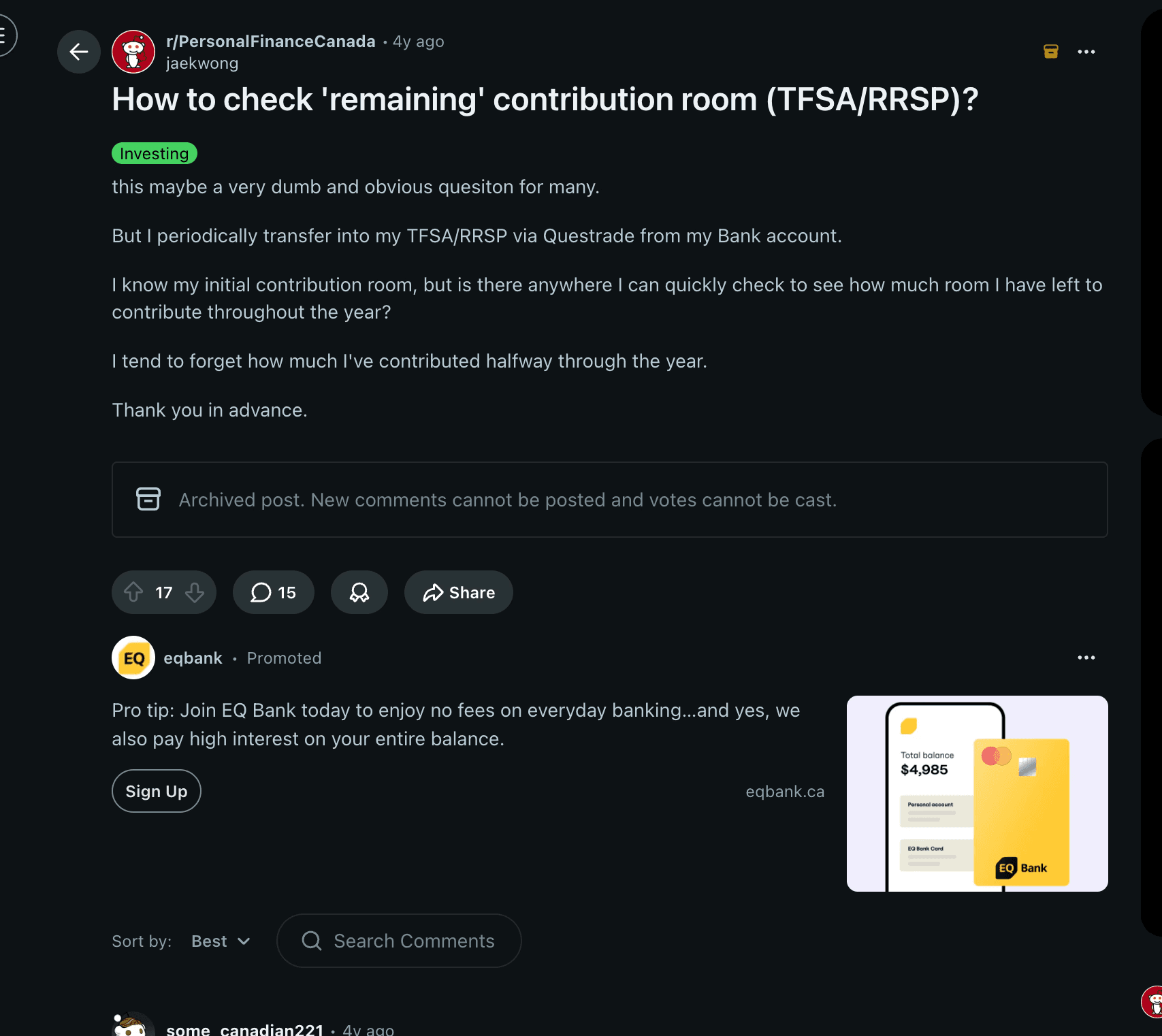
🔗 Reddit
Secondary Research Backing -
🔗 Reddit

#3
Cannot create multiple custom watchlists. For example, you can’t create one watchlist for “Tech” stocks and another for “Healthcare” stocks.
Secondary Research Backing -
🔗 Reddit

#2
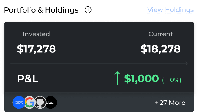
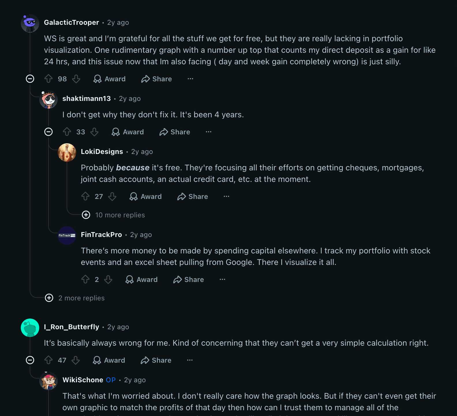
Holdings section does not show how many stocks of a company the user owns and what is the unrealized P&L for that holding, it instead shows the current price the stock is trading at and price difference since opening.
Holdings section does not show how many stocks of a company the user owns and what is the unrealized P&L for that holding, it instead shows the current price the stock is trading at and price difference since opening.
Secondary Research Backing -
🔗 Reddit
Secondary Research Backing -
🔗 Reddit
#2
Holdings section does not show how many stocks of a company a user owns and what is the unrealized P&L for that holding, it instead shows the current price the stock is trading at and price difference since opening.
Secondary Research Backing -
🔗 Reddit
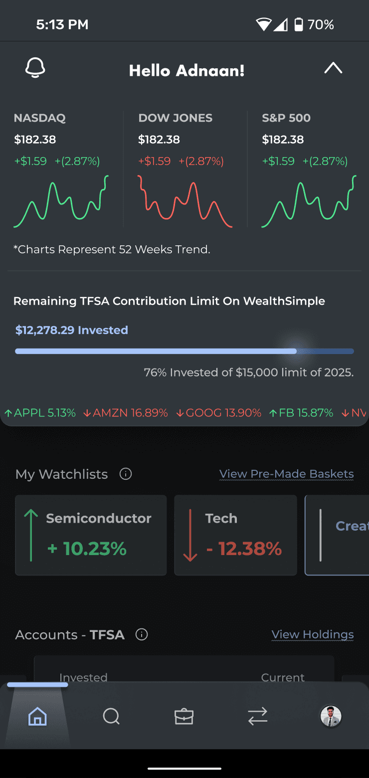
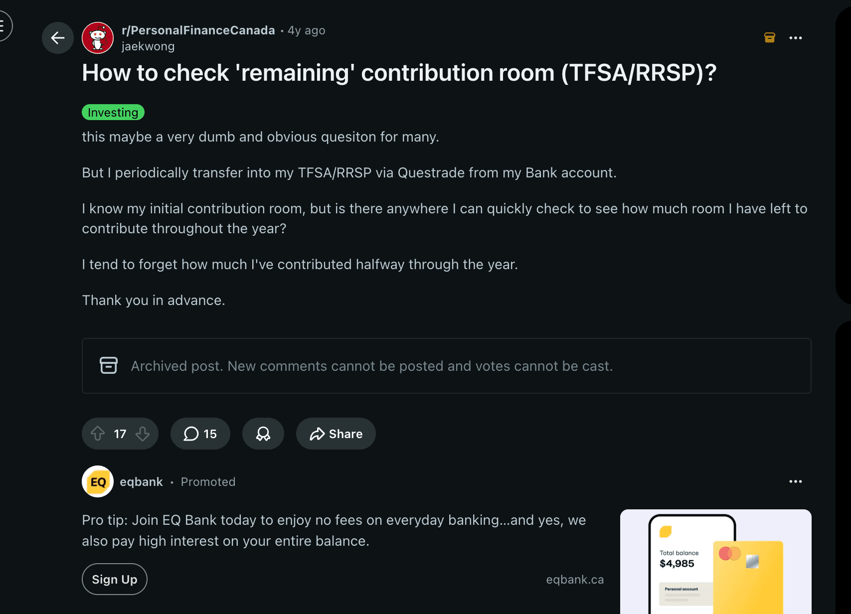
The app shows how much the user has invested in their *Wealthsimple TFSA* for current financial year. Most users want to know their “remaining” contribution room instead.
The app shows how much the user has invested in their *Wealthsimple TFSA* for current financial year. Most users want to know their “remaining” contribution room instead.
Secondary Research Backing -
🔗 Reddit link 1, Reddit link 2, Reddit link 3
Secondary Research Backing -
🔗 Reddit link 1, Reddit link 2, Reddit link 3
#1
The app shows how much the user has invested in their *Wealthsimple TFSA* for current financial year. Most users want to know their “remaining” contribution room instead.
Secondary Research Backing -
🔗 Reddit link 1, Reddit link 2, Reddit link 3
#1

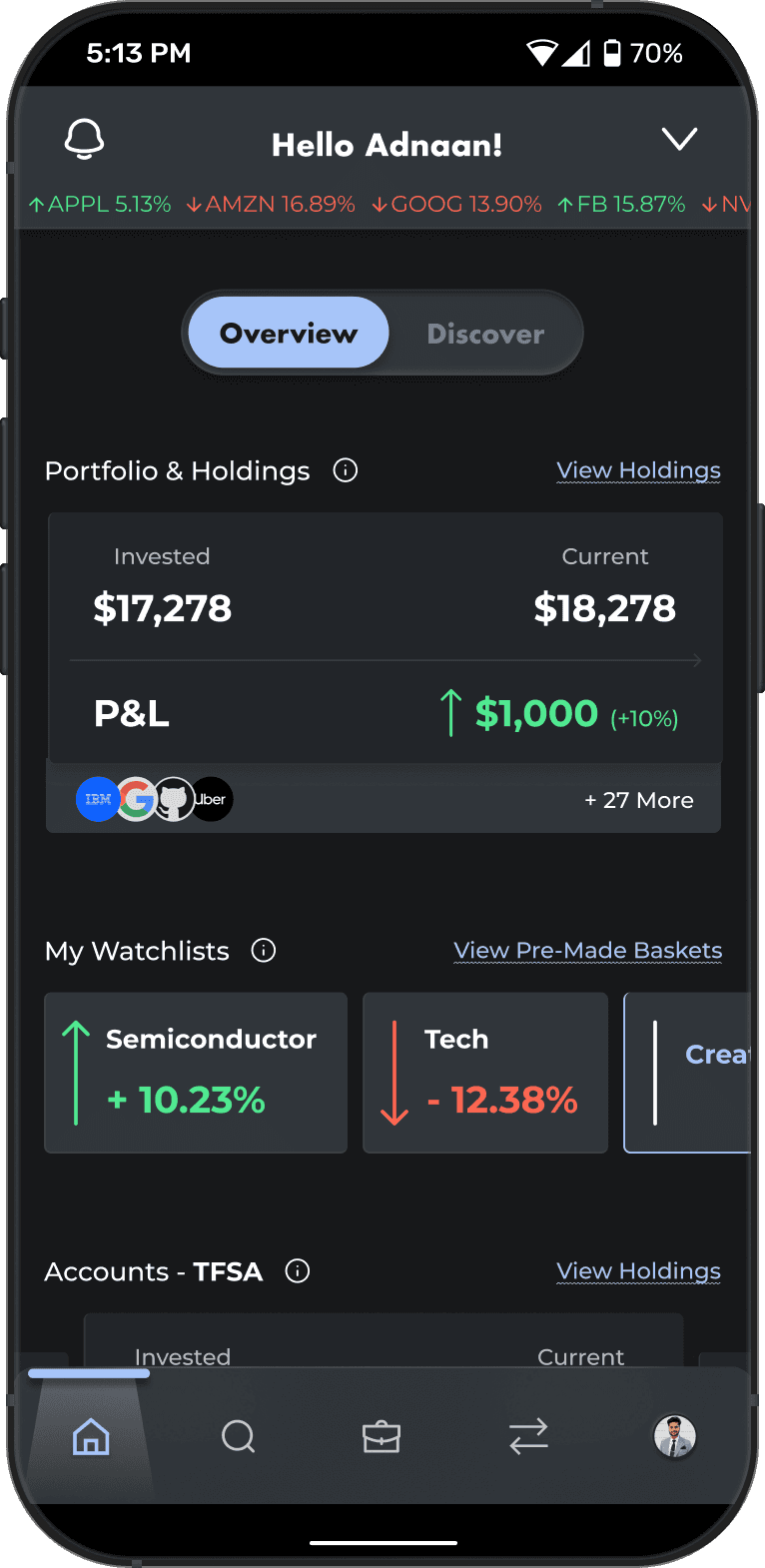
Sneak Peek Of The New Proposed WealthSimple App.
Sneak Peek Of The New Proposed WealthSimple App.
Sneak Peek Of The New Proposed WealthSimple App.
Not just vibes, there's method to this madness
Not just vibes, there's method to this madness
Problem & Proposed Solution.
Problem & Proposed Solution.
Problem & Solution.
#1
Current App Problem
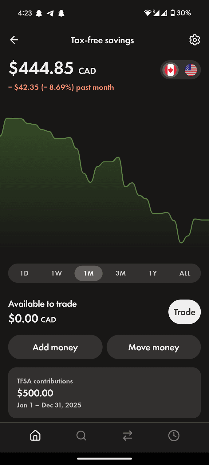
User interviews highlighted two key gaps:
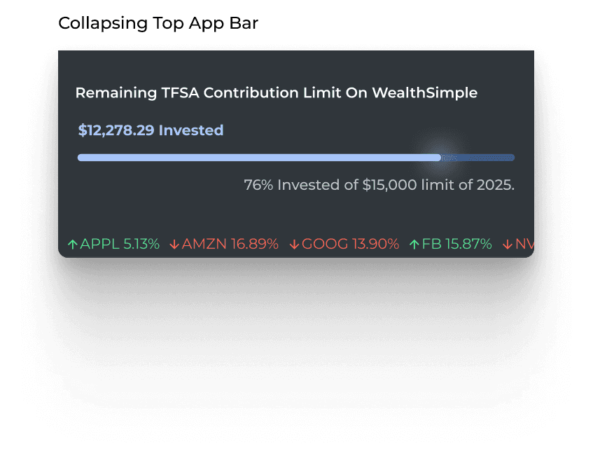
1) Users currently can’t easily see how much TFSA contribution room they have left this year, only how much they’ve already invested.
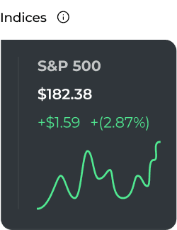
2) There’s no quick way to gauge daily market performance, as users can’t pin key indices for at-a-glance insights.#1
Potential Solution
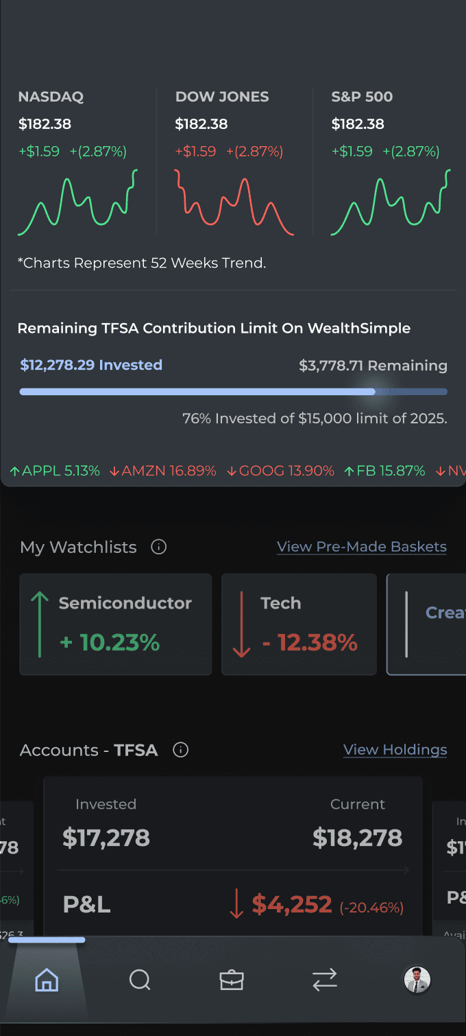
Design Rationale:
1) User's remaining TFSA contribution limit for the year is potrayed in 3 ways, viz. percentage, amount, and a progress bar.
2) Users can pin any indices for a quick view in their top bar of the app.#2
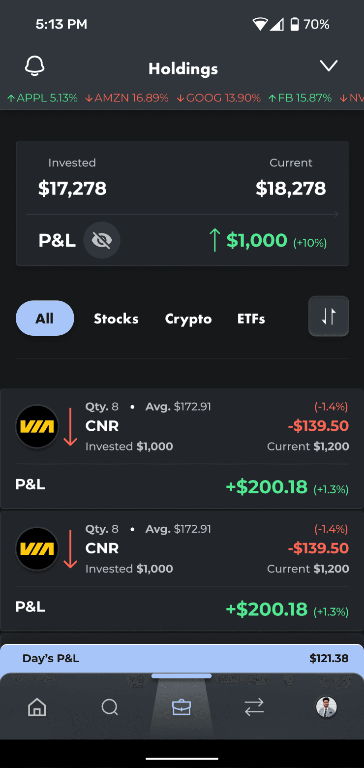
Current App Problem
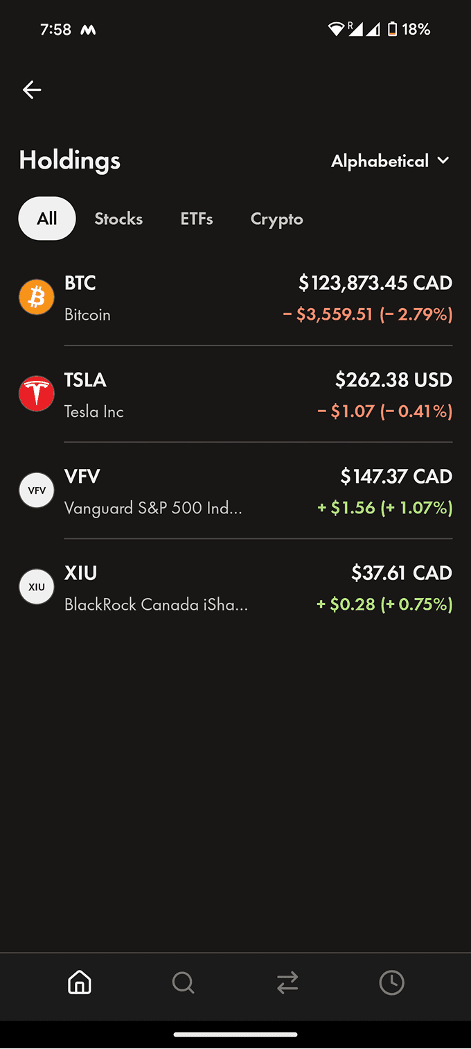
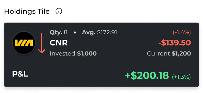
Two main issues: 1) Holdings section does not show how many stocks of a company the user owns and what is the unrealized profit or loss for each holding. 2) It instead prioritizes daily stock price movement and current price over portfolio insights users care about most.
#2
Potential Solution
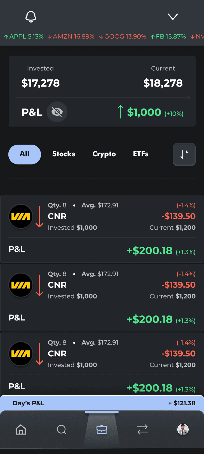
Design Rationale: 1) Overall Invested vs Current and P&L at a glance. Additionally, shows daily P&L of the entire portfolio. 2) Relevant information about each holding, per say, quantity, avg. price, P&L, and invested and current amout along with current real-time price per stock and daily movement
#3
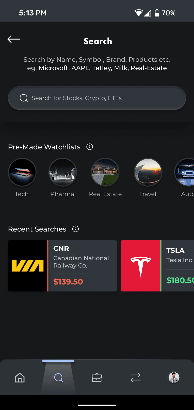
Current App Problem
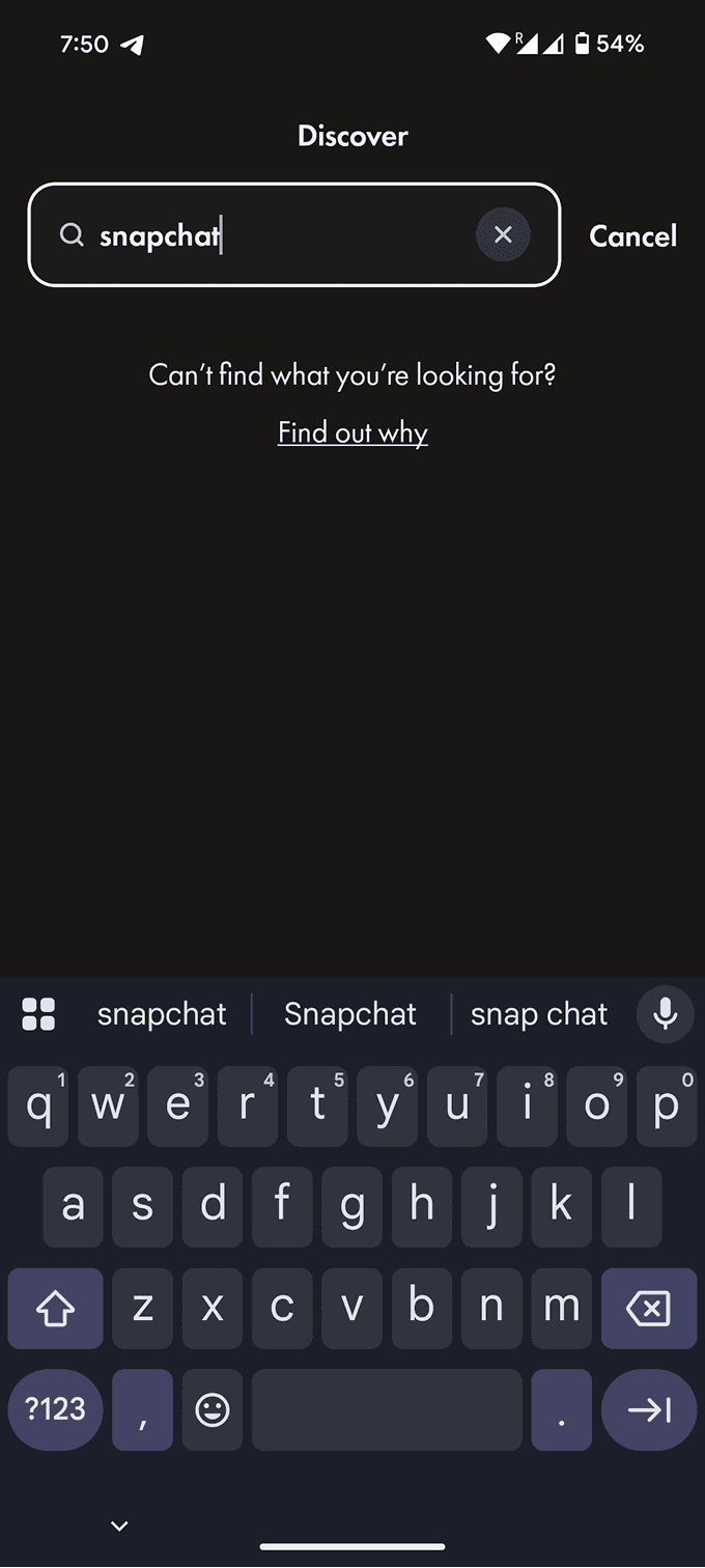
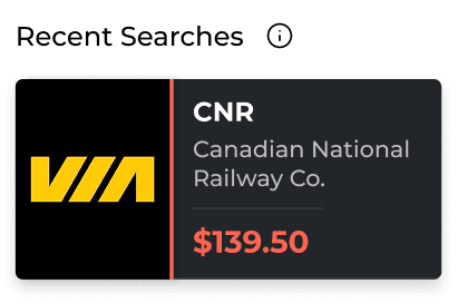
Pain Point: 1) Search is overly dependent on exact ticker symbols. For eg, search for "snapchat" yields no results, whereas "SNAP" does. This makes it difficult for users to find and invest in a certain company if they don't know it's exact ticker symbol.
#3
Potential Solution
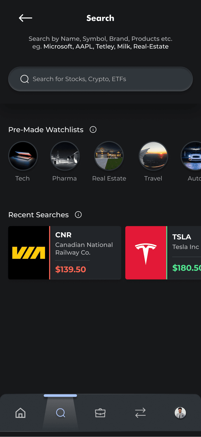
Design Rationale: 1) The new design uses AI-powered search to go beyond ticker symbols and company names, allowing users to discover stocks through brands, products, and categories (e.g. Tetley or milk). 2) Also provides recent searches and pre-made categories watchlists.
#4
Current App Problem
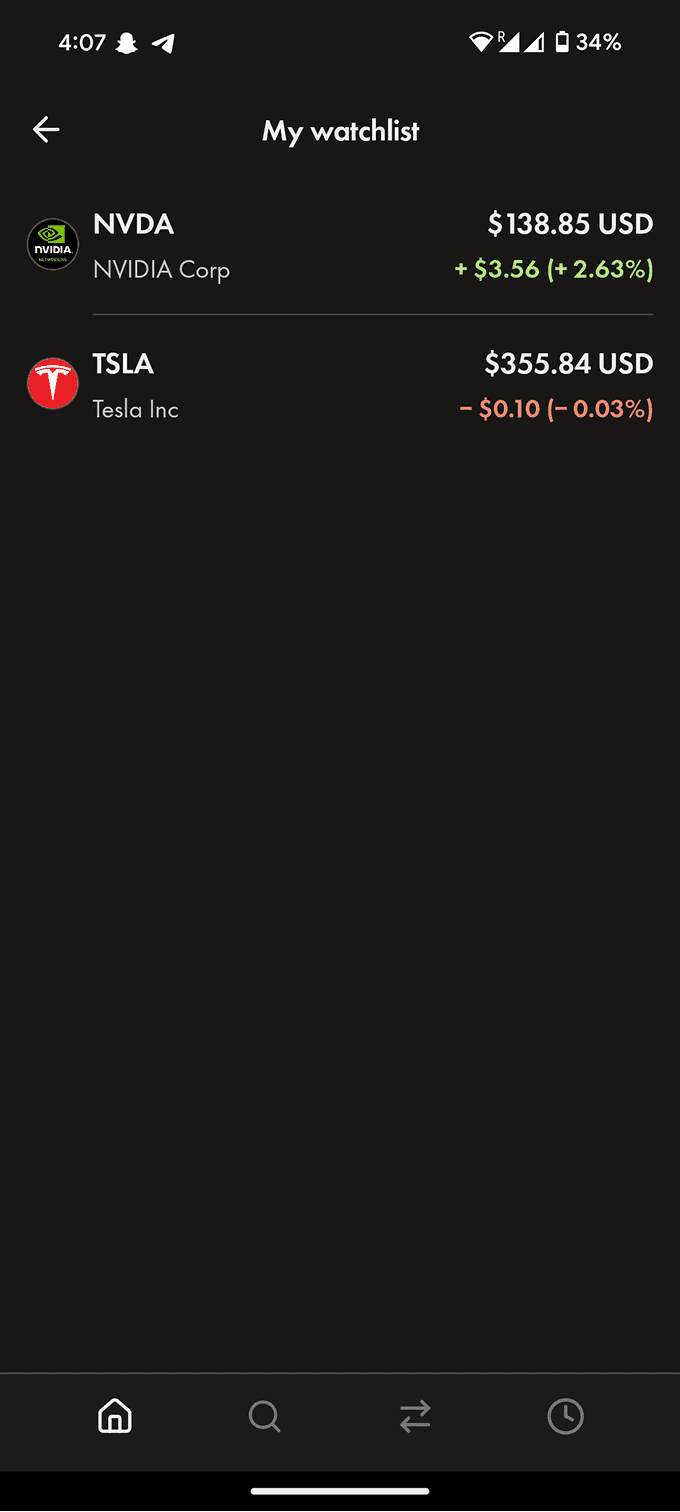
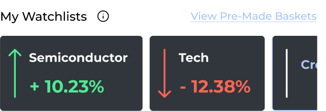
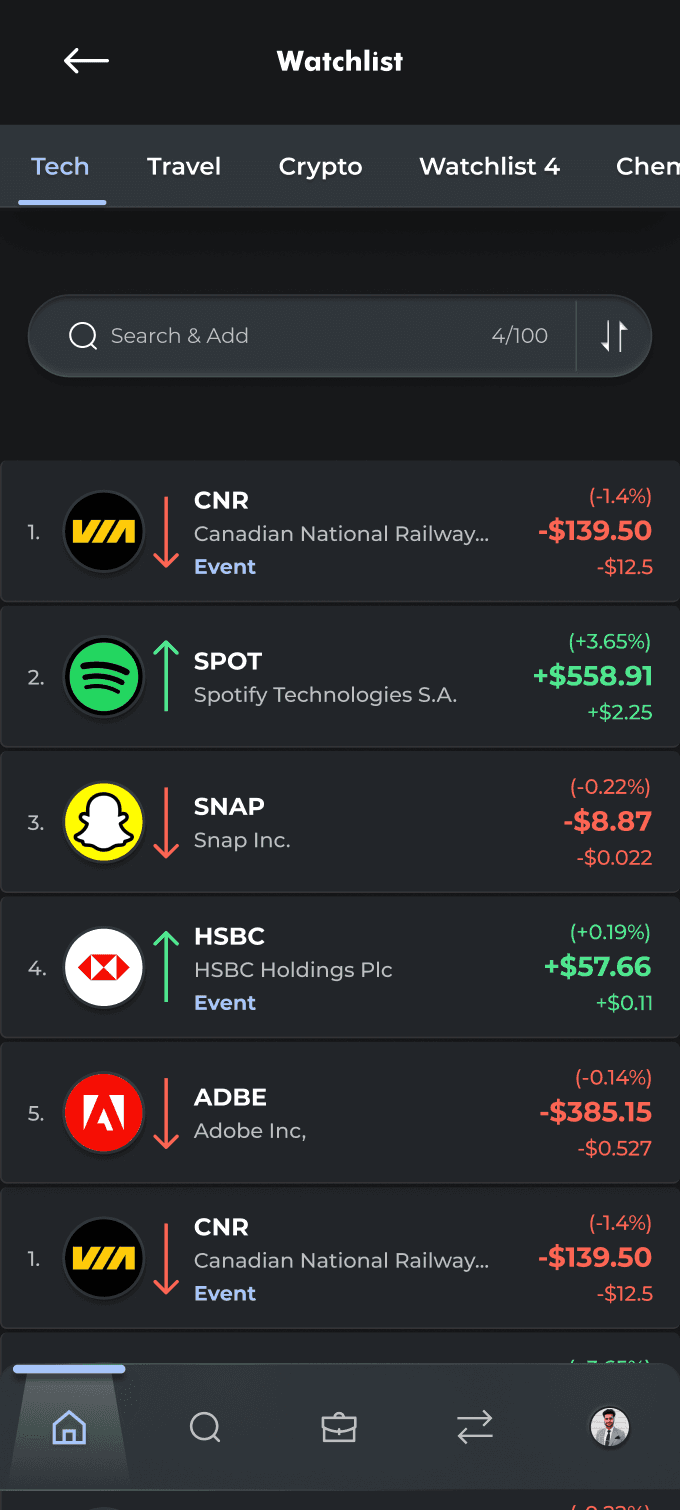
User interviews highlighted two key gaps: 1) Users can’t create multiple custom watchlists, forcing all symbols that the user wants to track into an endless, single, unstructured list. 2) The existing watchlist lacks search, sort, and filter tools, making it difficult to organize and track investments efficiently.
#4
Potential Solution
Design Rationale:
1) Users can create multiple custom watchlists and add symbols to any of these watchlists according to their choice to support compartmentalization.
2) Additionally, each watchlist shows cumalative positive or negative movement throughout the day and has filter, search and sort tools.#5
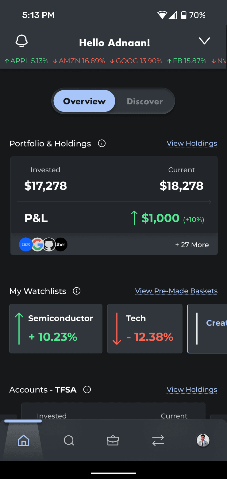
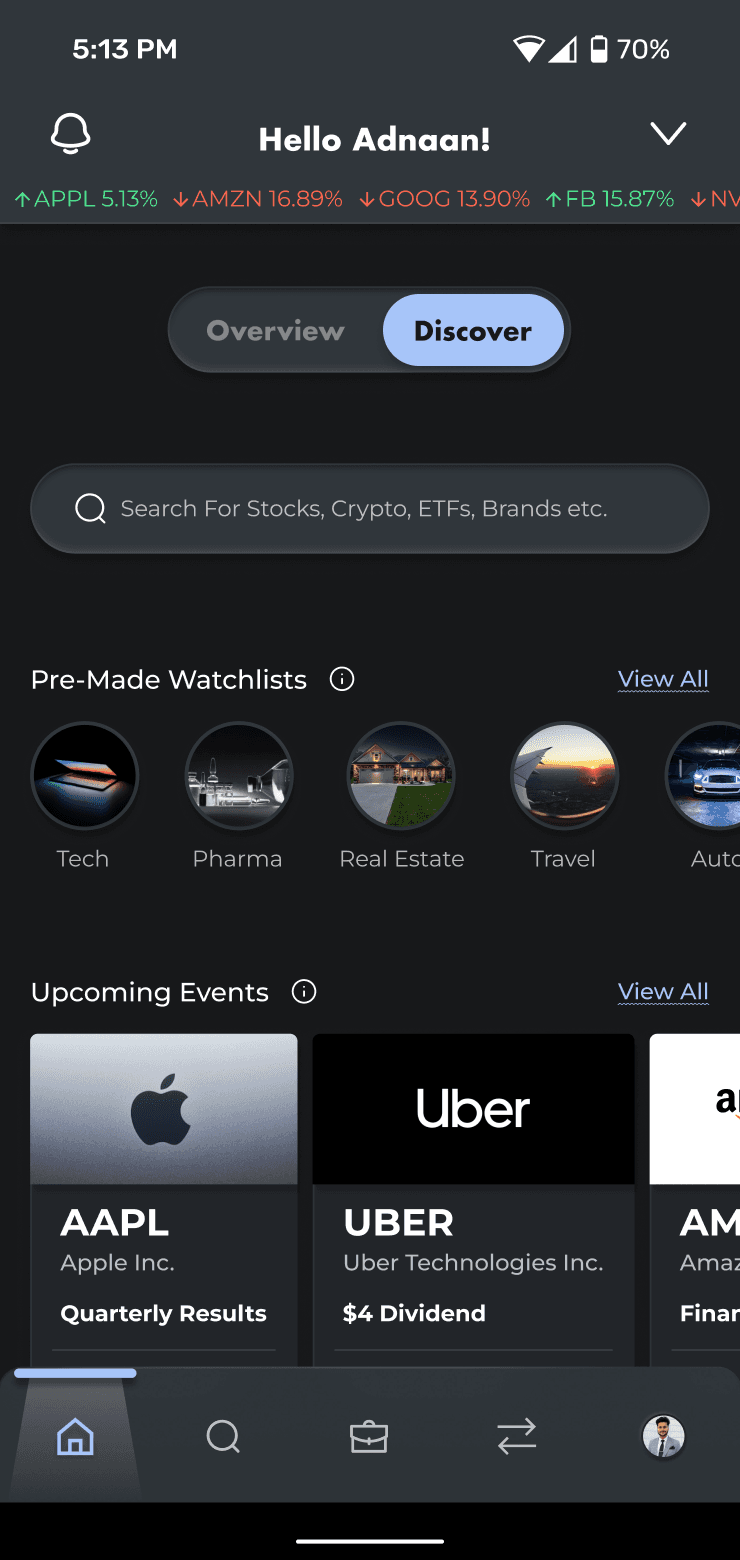
Current App Problem
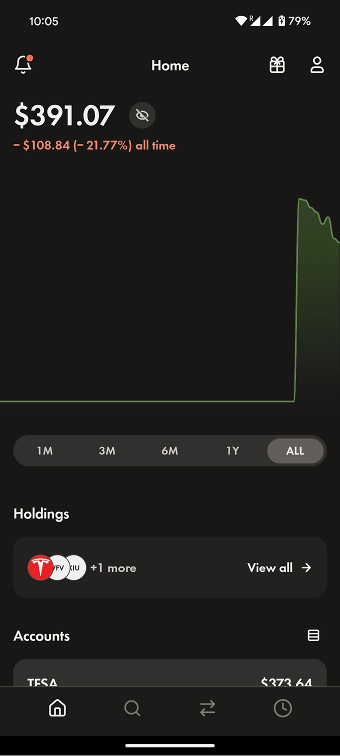
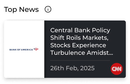
User research highlighted two key gaps: 1) Main above the fold screen is covered with a portfolio graph which offers limited actionable insight, making key portfolio information harder to access. 2) The existing design lacks market context, with no visibility into holdings, accounts, news, events, or sentiment that influence investment decisions.
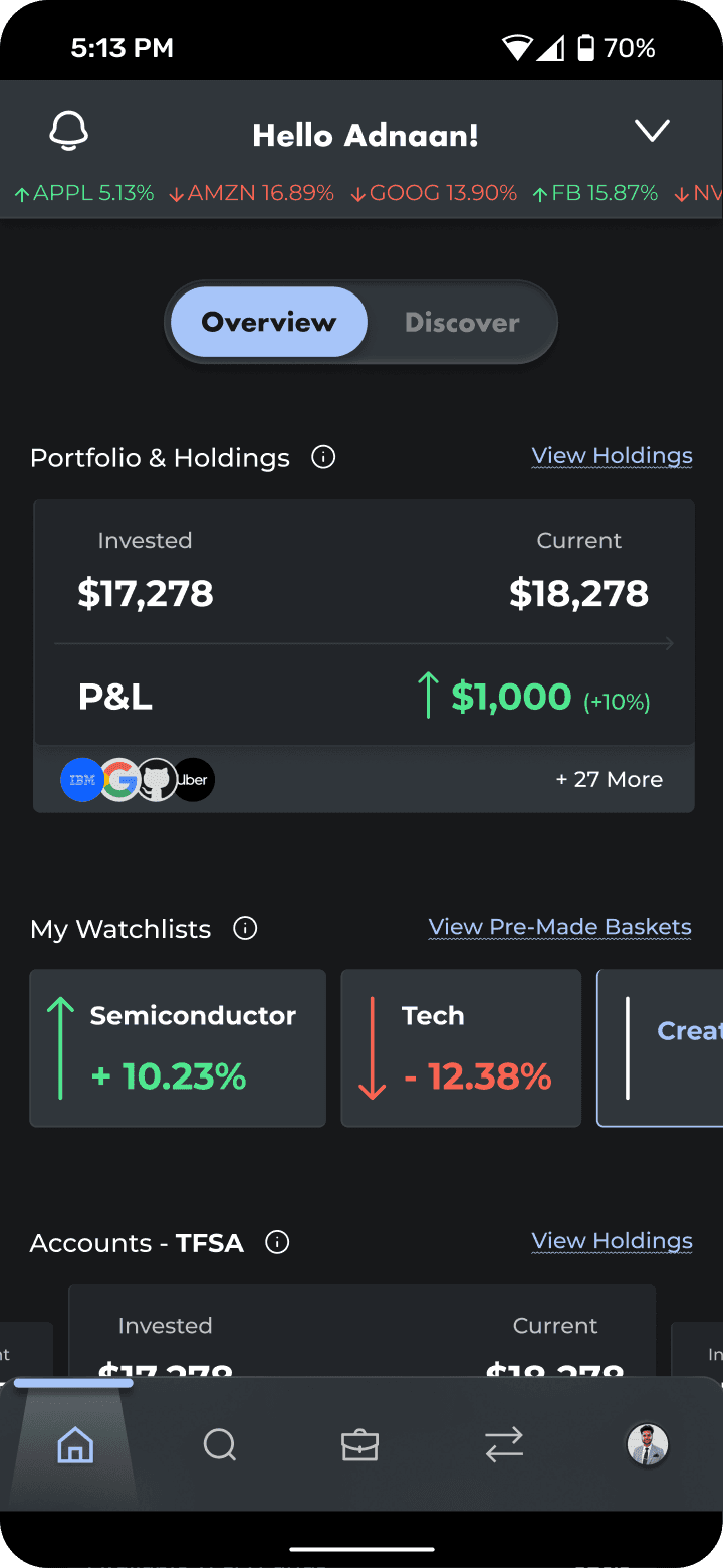
#5
Potential Solution
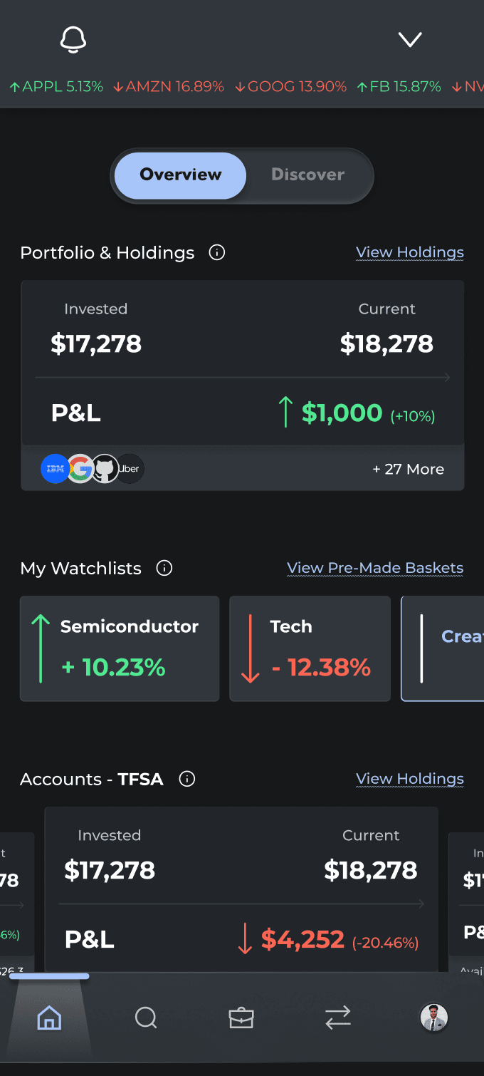
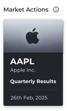
Design Rationale: 1) Quick sneak peek into users investment (if their money grew or not and how much). 2) Quick access to custom watchlists, and each of users account performance at a glance. 3) Real time stocks ticker, news, and events section in the discover tab.
#1
Current App Problem
User interviews highlighted two key gaps:
1) Users currently can’t easily see how much TFSA contribution room they have left this year, only how much they’ve already invested.
2) There’s no quick way to gauge daily market performance, as users can’t pin key indices for at-a-glance insights.#1
Potential Solution
Design Rationale:
1) User's remaining TFSA contribution limit for the year is potrayed in 3 ways, viz. percentage, amount, and a progress bar.
2) Users can pin any indices for a quick view in their top bar of the app.#2
Current App Problem
Two main issues: 1) Holdings section does not show how many stocks of a company the user owns and what is the unrealized profit or loss for each holding. 2) It instead prioritizes daily stock price movement and current price over portfolio insights users care about most.
#2
Potential Solution
Design Rationale: 1) Overall Invested vs Current and P&L at a glance. Additionally, shows daily P&L of the entire portfolio. 2) Relevant information about each holding, per say, quantity, avg. price, P&L, and invested and current amout along with current real-time price per stock and daily movement
#3
Current App Problem
Pain Point: 1) Search is overly dependent on exact ticker symbols. For eg, search for "snapchat" yields no results, whereas "SNAP" does. This makes it difficult for users to find and invest in a certain company if they don't know it's exact ticker symbol.
#3
Potential Solution
Design Rationale: 1) The new design uses AI-powered search to go beyond ticker symbols and company names, allowing users to discover stocks through brands, products, and categories (e.g. Tetley or milk). 2) Also provides recent searches and pre-made categories watchlists.
#4
Current App Problem
User interviews highlighted two key gaps: 1) Users can’t create multiple custom watchlists, forcing all symbols that the user wants to track into an endless, single, unstructured list. 2) The existing watchlist lacks search, sort, and filter tools, making it difficult to organize and track investments efficiently.
#4
Potential Solution
Design Rationale:
1) Users can create multiple custom watchlists and add symbols to any of these watchlists according to their choice to support compartmentalization.
2) Additionally, each watchlist shows cumalative positive or negative movement throughout the day and has filter, search and sort tools.#5
Current App Problem
User research highlighted two key gaps: 1) Main above the fold screen is covered with a portfolio graph which offers limited actionable insight, making key portfolio information harder to access. 2) The existing design lacks market context, with no visibility into holdings, accounts, news, events, or sentiment that influence investment decisions.
#5
Potential Solution
Design Rationale: 1) Quick sneak peek into users investment (if their money grew or not and how much). 2) Quick access to custom watchlists, and each of users account performance at a glance. 3) Real time stocks ticker, news, and events section in the discover tab.
#1
Current App Problem
User interviews highlighted two key gaps:
1) Users currently can’t easily see how much TFSA contribution room they have left this year, only how much they’ve already invested.
2) There’s no quick way to gauge daily market performance, as users can’t pin key indices for at-a-glance insights.#1
Potential Solution
Design Rationale:
1) User's remaining TFSA contribution limit for the year is potrayed in 3 ways, viz. percentage, amount, and a progress bar.
2) Users can pin any indices for a quick view in their top bar of the app.#2
Current App Problem
Two main issues: 1) Holdings section does not show how many stocks of a company the user owns and what is the unrealized profit or loss for each holding. 2) It instead prioritizes daily stock price movement and current price over portfolio insights users care about most.
#2
Potential Solution
Design Rationale: 1) Overall Invested vs Current and P&L at a glance. Additionally, shows daily P&L of the entire portfolio. 2) Relevant information about each holding, per say, quantity, avg. price, P&L, and invested and current amout along with current real-time price per stock and daily movement
#3
Current App Problem
Pain Point: 1) Search is overly dependent on exact ticker symbols. For eg, search for "snapchat" yields no results, whereas "SNAP" does. This makes it difficult for users to find and invest in a certain company if they don't know it's exact ticker symbol.
#3
Potential Solution
Design Rationale: 1) The new design uses AI-powered search to go beyond ticker symbols and company names, allowing users to discover stocks through brands, products, and categories (e.g. Tetley or milk). 2) Also provides recent searches and pre-made categories watchlists.
#4
Current App Problem
User interviews highlighted two key gaps: 1) Users can’t create multiple custom watchlists, forcing all symbols that the user wants to track into an endless, single, unstructured list. 2) The existing watchlist lacks search, sort, and filter tools, making it difficult to organize and track investments efficiently.
#4
Potential Solution
Design Rationale:
1) Users can create multiple custom watchlists and add symbols to any of these watchlists according to their choice to support compartmentalization.
2) Additionally, each watchlist shows cumalative positive or negative movement throughout the day and has filter, search and sort tools.#5
Current App Problem
User research highlighted two key gaps: 1) Main above the fold screen is covered with a portfolio graph which offers limited actionable insight, making key portfolio information harder to access. 2) The existing design lacks market context, with no visibility into holdings, accounts, news, events, or sentiment that influence investment decisions.
#5
Potential Solution
Design Rationale: 1) Quick sneak peek into users investment (if their money grew or not and how much). 2) Quick access to custom watchlists, and each of users account performance at a glance. 3) Real time stocks ticker, news, and events section in the discover tab.
Who's doing what and who's doing it well?
Who's doing what and who's doing it well?
Competitive Analysis.
Competitive Analysis.
Competitive Analysis.
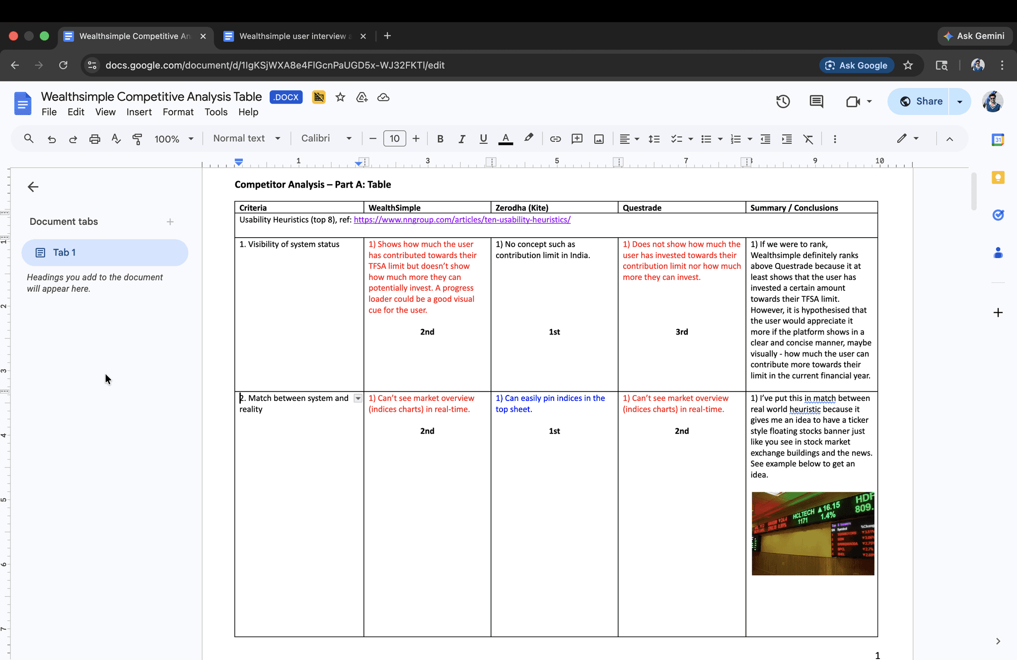
Tap For More Info!
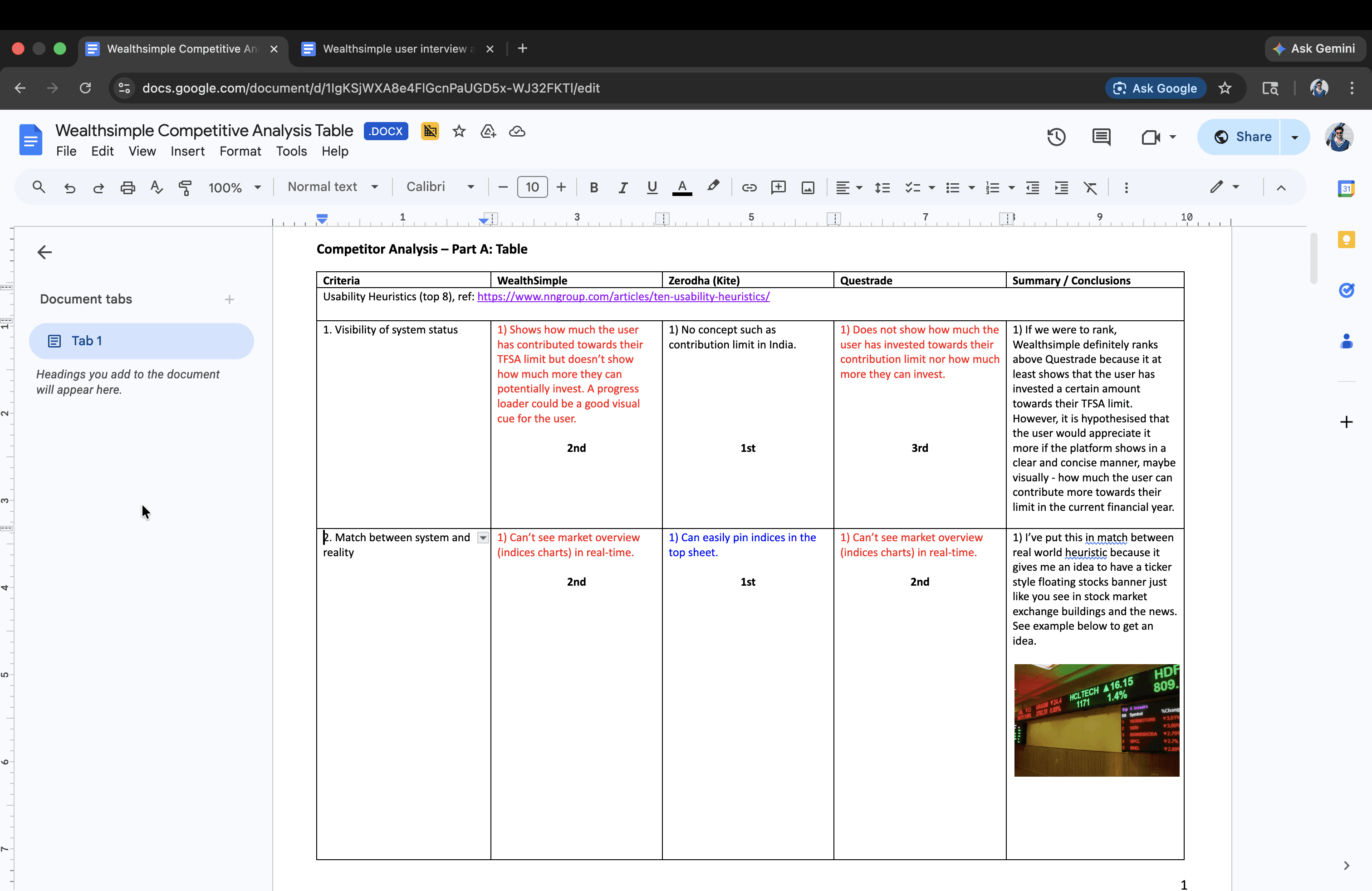
I explored how modern investing platforms guide and retain users through a competitive analysis of Wealthsimple, Questrade (direct competitor), and Zerodha (India's biggest trading platform). Using competitive analysis, SWOT frameworks, and hypotheses grounded in Nielsen’s Heuristic Principles, I identified key opportunities to improve onboarding and investment clarity. The researcg document also consists of two iterations of a redesigned user flow for the new proposed Wealthsimple app experience. Tap the link below to get to know more!
Tap For More Info!
I explored how modern investing platforms guide and retain users through a competitive analysis of Wealthsimple, Questrade (direct competitor), and Zerodha (India's biggest trading platform). Using competitive analysis, SWOT frameworks, and hypotheses grounded in Nielsen’s Heuristic Principles, I identified key opportunities to improve onboarding and investment clarity. The researcg document also consists of two iterations of a redesigned user flow for the new proposed Wealthsimple app experience. Tap the link below to get to know more!
Tap For More Info!
I explored how modern investing platforms guide and retain users through a competitive analysis of Wealthsimple, Questrade (direct competitor), and Zerodha (India's biggest trading platform). Using competitive analysis, SWOT frameworks, and hypotheses grounded in Nielsen’s Heuristic Principles, I identified key opportunities to improve onboarding and investment clarity. The researcg document also consists of two iterations of a redesigned user flow for the new proposed Wealthsimple app experience. Tap the link below to get to know more!
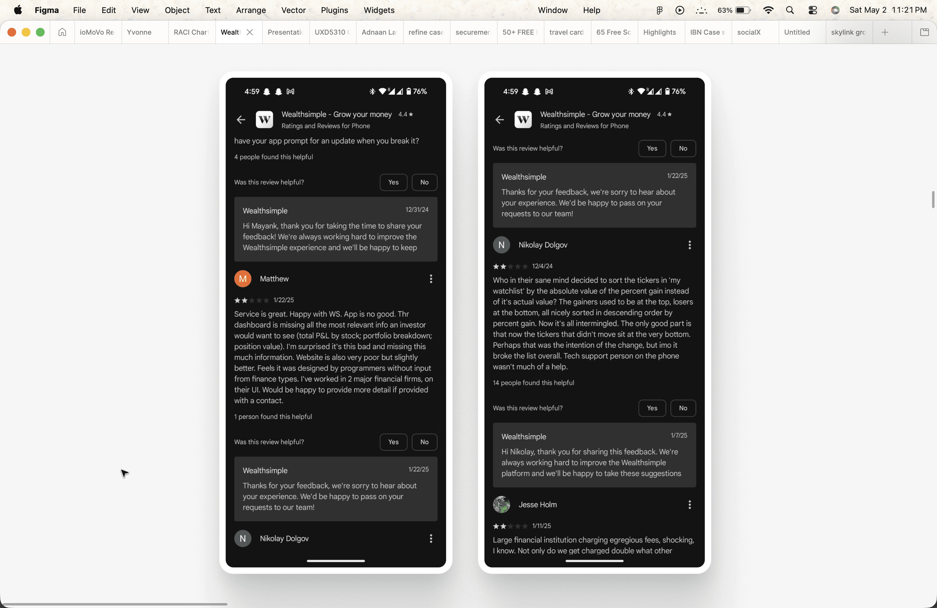
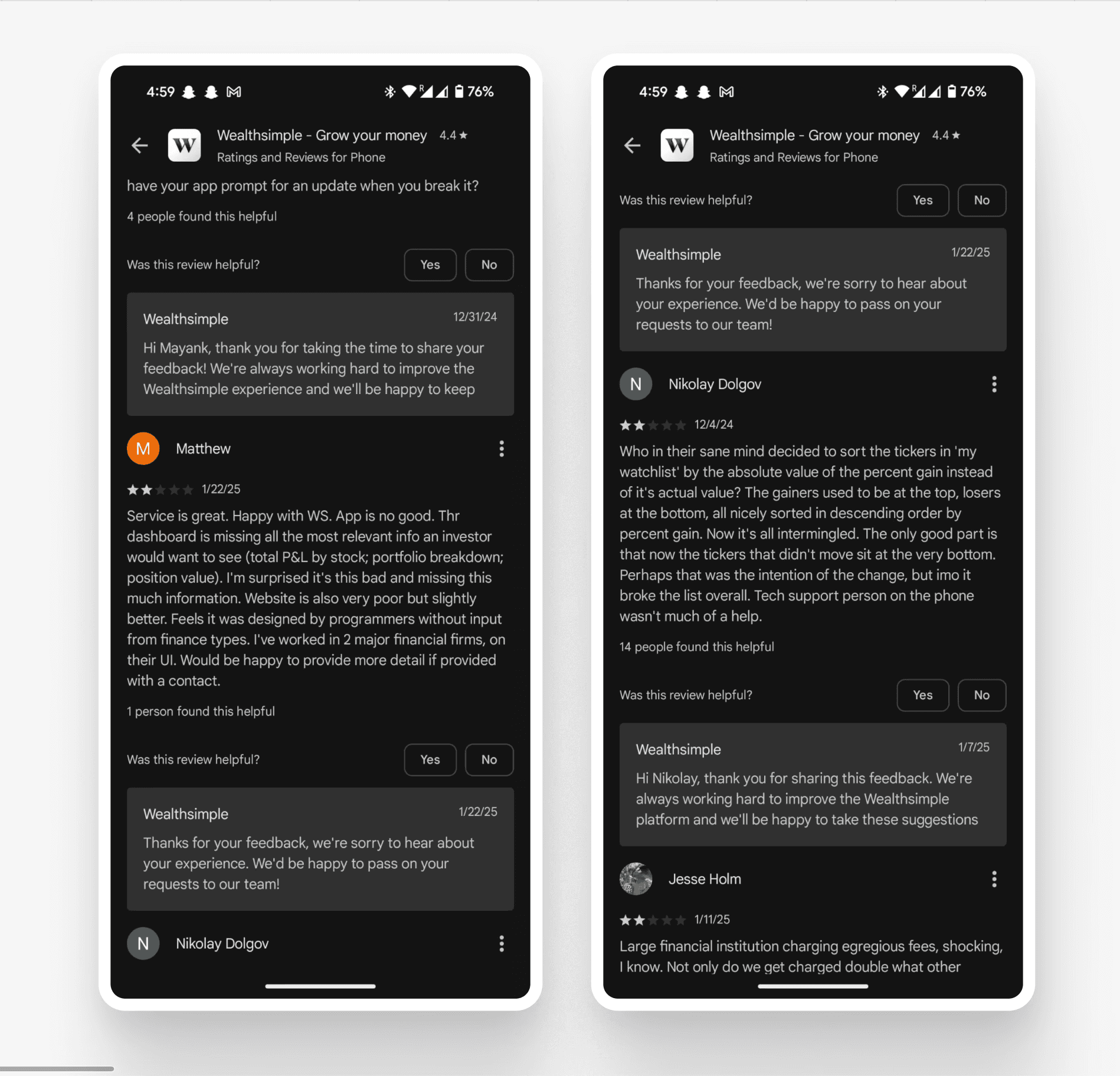
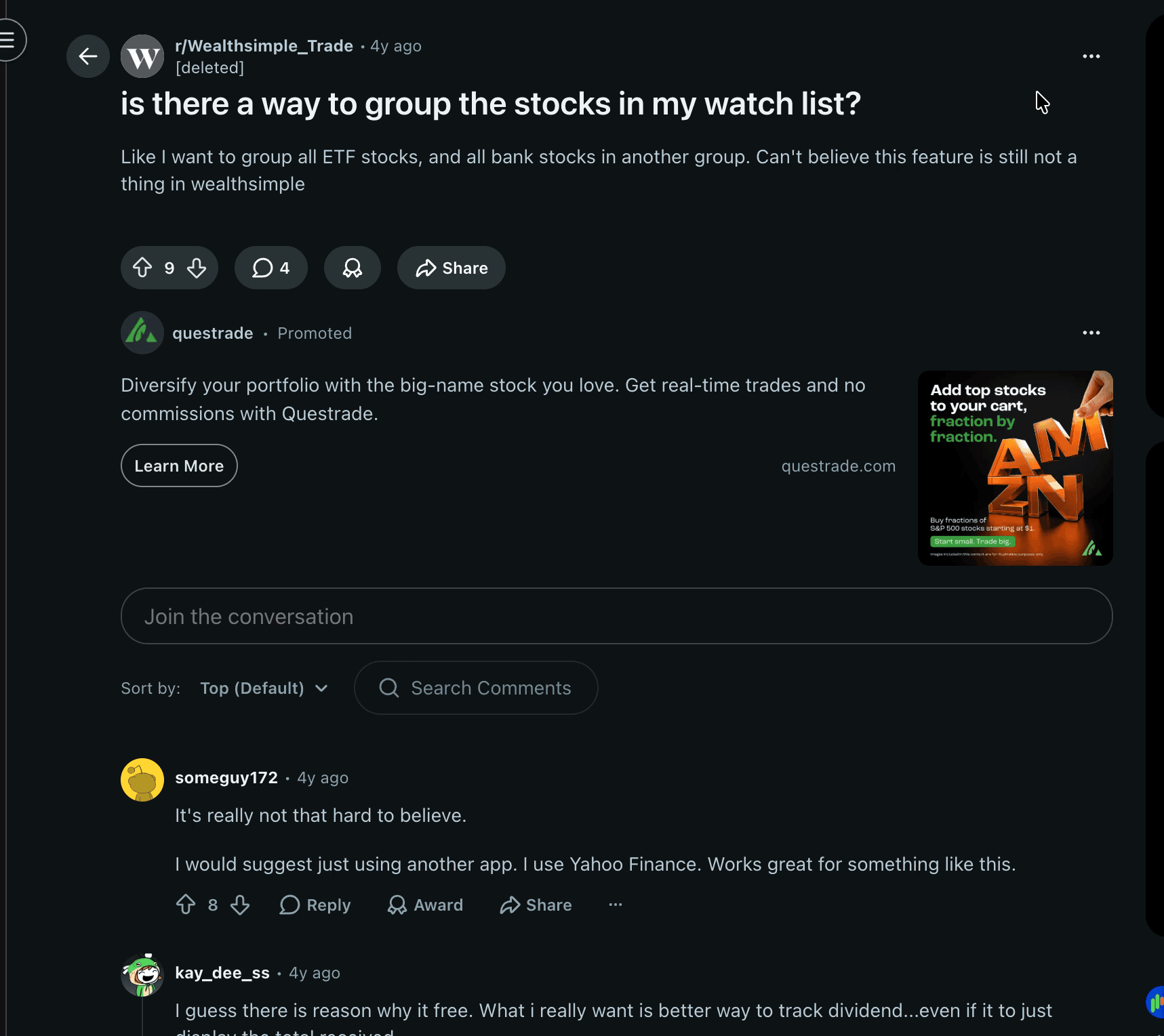
What the internet has to say
What the internet has to say
Secondary Research.
Secondary Research.
Secondary Research.
Discussion Guide & Listen For(s)
Discussion Guide & Listen For(s)
User Interview
Questions.
User Interview Questions.
Research Questions.
How do you usually invest your money on WealthSimple or any other local or global investment platforms and what does your overall experience look like? (4 min)
Listen for: Our pain points / high points, Competitor's pain points / high points, Expectations, features, frustrations, (If doesn’t invest through WealthSimple) → Why do they choose to invest via a competitor?
Can you sketch out what you think is an ideal experience right from opening the app for the first time as a new user to buying stocks in your TFSA account? Think aloud while sketching your experience and give as many details as possible. (Provide pen and paper). (12 min)
Imagine you are on the portfolio and holdings page (while pointing at their sketch "Portfolio page"), what do you expect to see there, give as many details as possible. (3 min)
According to your typical ideal journey, how do you track symbols or decide what to invest in and how do you find it on the app? (3 min)
How do you ensure you’re under the TFSA contribution limit? (3 min)
This is a picture of a user’s holdings on Wealthsimple, looking at this what can you deduce? (shows the screenshot) (7 min)
Moderated & In-Person Tests
Moderated & In-Person Tests
User Tests.
User Tests.
User Tests.
1. Track stocks in multiple custom made watchlists created.
1. Track stocks in multiple custom made watchlists created.
1. Track stocks in multiple custom made watchlists created.
Context:
Context:
Show wireframes of Home & Watchlist pages.
Show wireframes of Home & Watchlist pages.
Anticipated Steps:
Anticipated Steps:
Home > View All Watchlists (Notice Cumulative Watchlist % Increase/Decrease) > View a Specific Watchlist Page.
Home > View All Watchlists (Notice Cumulative Watchlist % Increase/Decrease) > View a Specific Watchlist Page.
Probe:
Probe:
What do you think those numbers denote besides watchlist names?
What do you think those numbers denote besides watchlist names?
Goal:
Goal:
See if the user understands that those numbers are cumulative % of all the stocks inside the watchlist that the user created.
See if the user understands that those numbers are cumulative % of all the stocks inside the watchlist that the user created.
2. Track *individual* investments exact P&L.
2. Track *individual* investments exact P&L.
2. Track *individual* investments exact P&L.
Context:
Context:
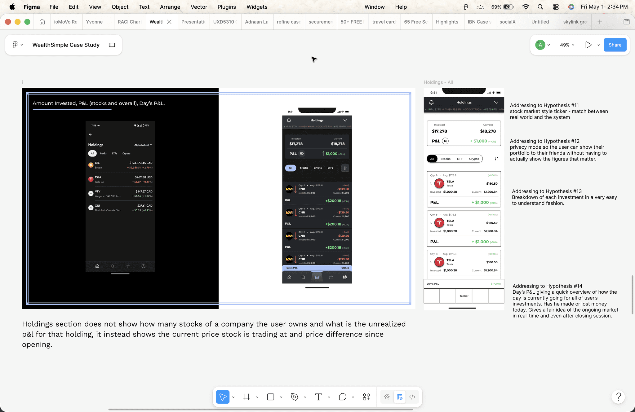
Show wireframes of the Holdings page.
Show wireframes of the Holdings page.
Anticipated Steps:
Anticipated Steps:
Home > TFSA (this step should be optional) > Holdings.
Home > TFSA (this step should be optional) > Holdings.
Probe:
Probe:
What is the effective profit/loss and can you share your portfolio details with a friend without actually showing the key figures and numbers? (privacy mode).
What is the effective profit/loss and can you share your portfolio details with a friend without actually showing the key figures and numbers? (privacy mode).
Goal:
Goal:
See if the user easily understands their profits and losses and notices the privacy mode feature along the way.
See if the user easily understands their profits and losses and notices the privacy mode feature along the way.
3. Using stock analysis tools before investing in a stock.
3. Using stock analysis tools before investing in a stock.
3. Using stock analysis tools before investing in a stock.
Context:
Context:
Show individual core symbol's screen page.
Show individual core symbol's screen page.
Anticipated Steps:
Anticipated Steps:
Home > Watchlist / Search > Symbol's Page.
Home > Watchlist / Search > Symbol's Page.
Probe:
Probe:
How do you make up your mind to invest in Tesla at that specific moment (see if they do basic stock analyses and look at comparison’s feature).
How do you make up your mind to invest in Tesla at that specific moment (see if they do basic stock analyses and look at comparison’s feature).
Goal:
Goal:
See if the user really needs basic stock analysis for investments and actually appreciates the compare feature or not.
See if the user really needs basic stock analysis for investments and actually appreciates the compare feature or not.
Turns out the data had opinions and they didn’t hold back
Turns out the data had opinions and they didn’t hold back
Research Findings.
Research Findings.
Research Findings.
All participants easily understood the holding's page information in the new design including invested amount, current value, P&L, avg. price, quantity, and overall P&L.
All Participants
User Testing Session.
User's expressed that they'd rather appreciate seeing their *remaining* TFSA contribution limit instead of how much they've invested in TFSA so far which led to 2nd iteration hi-fi design.
Participants 2,4,5 and 8
User Interview Session.
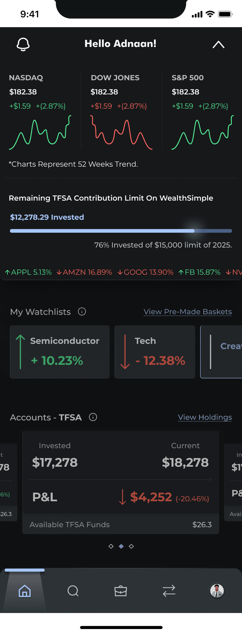
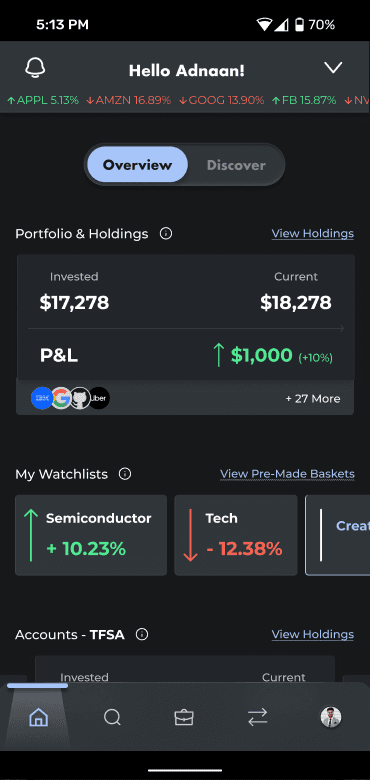
"What’s the point of a 'view all' watchlists page when I can only create 7 watchlists of 100 symbols each? It could easily be shown as a horizontal carousel on the home page". Thus, removed "view all" which reduces 1 less interaction step.
Participant 1
User Testing Session.
Participants prioritized market actions over “stocks last visited” on the Discover page. As a result, market actions were moved higher, while “stocks last visited” was relocated to the Search page where it fits better.
Few Participants
User Testing Session.
All participants easily understood the holding's page information in the new design including invested amount, current value, P&L, avg. price, quantity, and overall P&L.
All Participants
User Testing Session.
User's expressed that they'd rather appreciate seeing their *remaining* TFSA contribution limit instead of how much they've invested in TFSA so far which led to 2nd iteration hi-fi design.
Participants 2,4,5 and 8
User Interview Session.
"What’s the point of a 'view all' watchlists page when I can only create 7 watchlists of 100 symbols each? It could easily be shown as a horizontal carousel on the home page". Thus, removed "view all" which reduces 1 less interaction step.
Participant 1
User Testing Session.
Participants prioritized market actions over “stocks last visited” on the Discover page. As a result, market actions were moved higher, while “stocks last visited” was relocated to the Search page where it fits better.
Few Participants
User Testing Session.
All participants easily understood the holding's page information in the new design including invested amount, current value, P&L, avg. price, quantity, and overall P&L.
All Participants
User Testing Session.
User's expressed that they'd rather appreciate seeing their *remaining* TFSA contribution limit instead of how much they've invested in TFSA so far which led to 2nd iteration hi-fi design.
Participants 2,4,5 and 8
User Interview Session.
"What’s the point of a 'view all' watchlists page when I can only create 7 watchlists of 100 symbols each? It could easily be shown as a horizontal carousel on the home page". Thus, removed "view all" which reduces 1 less interaction step.
Participant 1
User Testing Session.
Participants prioritized market actions over “stocks last visited” on the Discover page. As a result, market actions were moved higher, while “stocks last visited” was relocated to the Search page where it fits better.
Few Participants
User Testing Session.
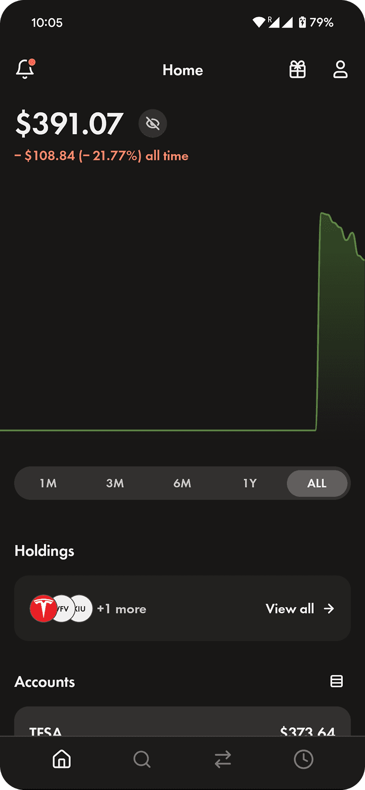
Drag The Slider Below
Drag The Slider Below
The Comparison.
The Comparison.
The Comparison.
Old Design
New Design

Designed on a 100 sleepless nights with ❤️, logic, and a lot of ☕️
Copyright © 2026 Adnaan Lalani.
All Rights Reserved.
UX DESIGN
❖
UX RESEARCH
❖
UI DESIGN
❖
PRODUCT DESIGN
❖
DESIGN AUDIT
❖
ZERO UI
❖
DAM DESIGN
❖
IA DESIGN
❖
EXPERIENCE DESIGN
❖
HUMAN CENTRED
❖
MICRO INTERACTIONS DESIGN
❖
BIAS FREE RESEARCH
❖
5 YEARS OF EXPERIENCE
❖
AI EMBEDDED DESIGN WORKFLOWS
❖
FRONT END DEV
❖
DATABASE DESIGN
❖
STORYTELLER
❖
VIBE CODE
❖
Designed on a 100 sleepless nights with ❤️, logic, and a lot of ☕️
Copyright © 2026 Adnaan Lalani.
All Rights Reserved.
UX DESIGN
❖
UX RESEARCH
❖
UI DESIGN
❖
PRODUCT DESIGN
❖
DESIGN AUDIT
❖
ZERO UI
❖
DAM DESIGN
❖
IA DESIGN
❖
EXPERIENCE DESIGN
❖
HUMAN CENTRED
❖
MICRO INTERACTIONS DESIGN
❖
BIAS FREE RESEARCH
❖
5 YEARS OF EXPERIENCE
❖
AI EMBEDDED DESIGN WORKFLOWS
❖
FRONT END DEV
❖
DATABASE DESIGN
❖
STORYTELLER
❖
VIBE CODE
❖
Designed on a 100 nights with ❤️, logic, and a lot of ☕️
Copyright © 2026 Adnaan Lalani.
All Rights Reserved.
UX DESIGN
❖
UX RESEARCH
❖
UI DESIGN
❖
PRODUCT DESIGN
❖
DESIGN AUDIT
❖
ZERO UI
❖
DAM DESIGN
❖
IA DESIGN
❖
EXPERIENCE DESIGN
❖
HUMAN CENTRED
❖
MICRO INTERACTIONS DESIGN
❖
BIAS FREE RESEARCH
❖
5 YEARS OF EXPERIENCE
❖
AI EMBEDDED DESIGN WORKFLOWS
❖
FRONT END DEV
❖
DATABASE DESIGN
❖
STORYTELLER
❖
VIBE CODE
❖