
UX Research & UI Redesign
UX Research & UI Redesign
UX Research & UI Redesign
8 minutes read
8 minutes read
TTC ON-BOARD DISPLAY.
TTC ON-BOARD DISPLAY.
TTC ON-BOARD DISPLAY.
How might we reimagine the on-board TTC bus display as a single, reliable source of truth for riders? Instead of relying on multiple mobile apps to track stops, ETAs, weather, routes, and transfers, how can users access all critical transit information directly on the bus display in a clear and intuitive way?
This hypothesis was validated through user research, interviews, and usability testing, to design a more holistic, centralized display which reduces cognitive load and makes transfers easier, faster, and more confidence-building for riders.
I was a solo UX researcher and product designer on this project. This process involved hypothesis recognition, understanding user pain points and their needs, proto persona, flaws with the current system with the help of secondary research, informal user interviews, guerrilla user testing sessions, wireframes and UI iterations, and final mockup.
How might we reimagine the on-board TTC bus display as a single, reliable source of truth for riders? Instead of relying on multiple mobile apps to track stops, ETAs, weather, routes, and transfers, how can users access all critical transit information directly on the bus display in a clear and intuitive way?
This hypothesis was validated through user research, interviews, and usability testing, to design a more holistic, centralized display which reduces cognitive load and makes transfers easier, faster, and more confidence-building for riders.
I was a solo UX researcher and product designer on this project. This process involved hypothesis recognition, understanding user pain points and their needs, proto persona, flaws with the current system with the help of secondary research, informal user interviews, guerrilla user testing sessions, wireframes and UI iterations, and final mockup.
How might we reimagine the on-board TTC bus display as a single, reliable source of truth for riders? Instead of relying on multiple mobile apps to track stops, ETAs, weather, routes, and transfers, how can users access all critical transit information directly on the bus display in a clear and intuitive way?
This hypothesis was validated through user research, interviews, and usability testing, to design a more holistic, centralized display which reduces cognitive load and makes transfers easier, faster, and more confidence-building for riders.
I was a solo UX researcher and product designer on this project. This process involved hypothesis recognition, understanding user pain points and their needs, proto persona, flaws with the current system with the help of secondary research, informal user interviews, guerrilla user testing sessions, wireframes and UI iterations, and final mockup.
Client :
Client :
Toronto Transit Commission
Toronto Transit Commission
Year :
Year :
2024
2024
Industry :
Industry :
Travel Tech
Travel Tech
Project Duration :
Project Duration :
6 weeks
6 weeks
0M+
0M+
Downloads of the Transit App
Downloads of the Transit App
0%
0%
Participants relied on apps when in TTC
Participants relied on apps when in TTC
0.0M
0.0M
People ride TTC busses daily
People ride TTC busses daily
The Hypothesis
1. Intro To Problem.
🛞
🛞
🛞
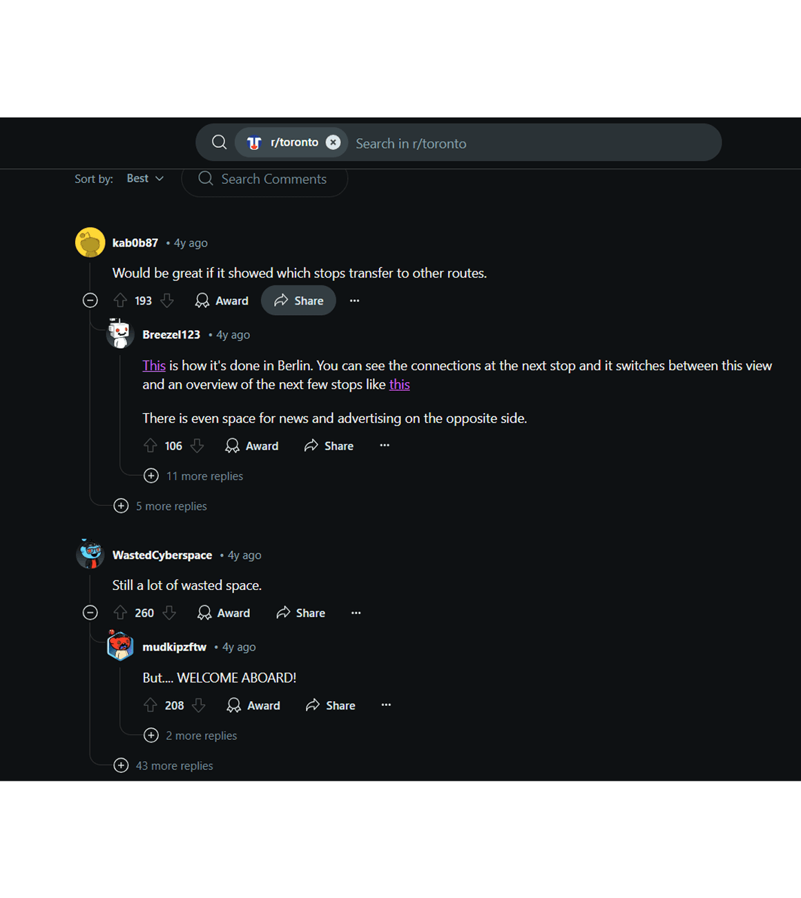
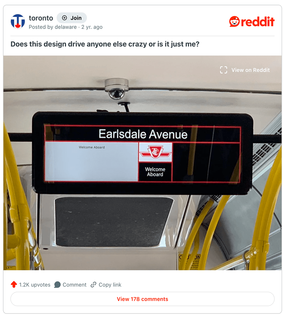
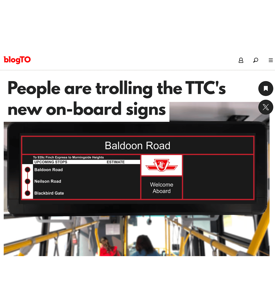
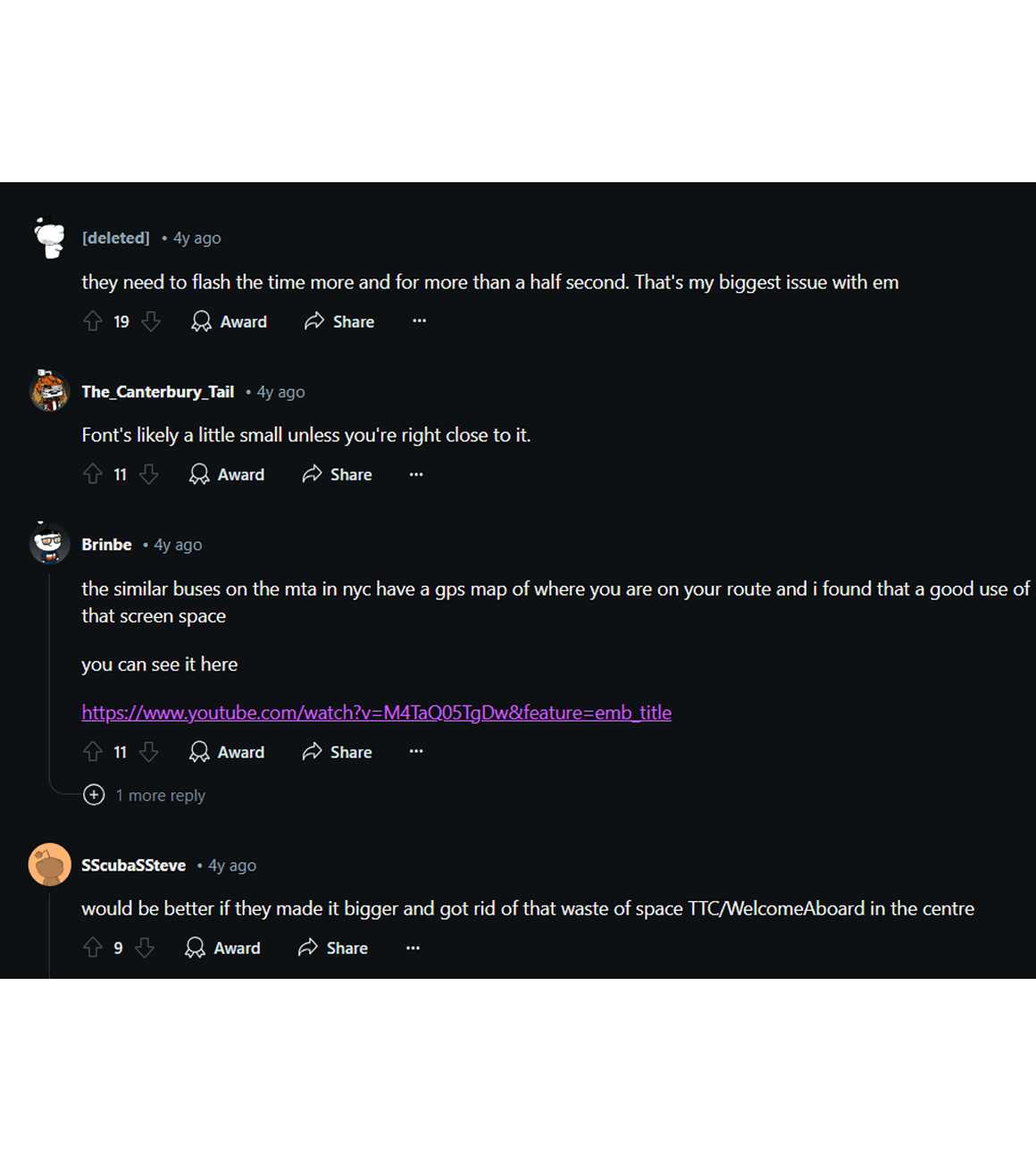
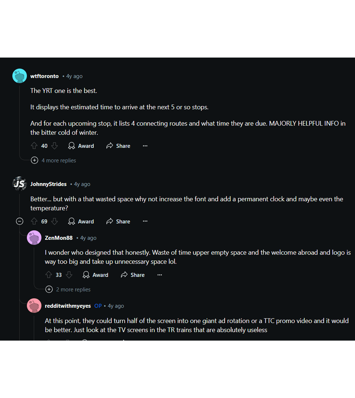
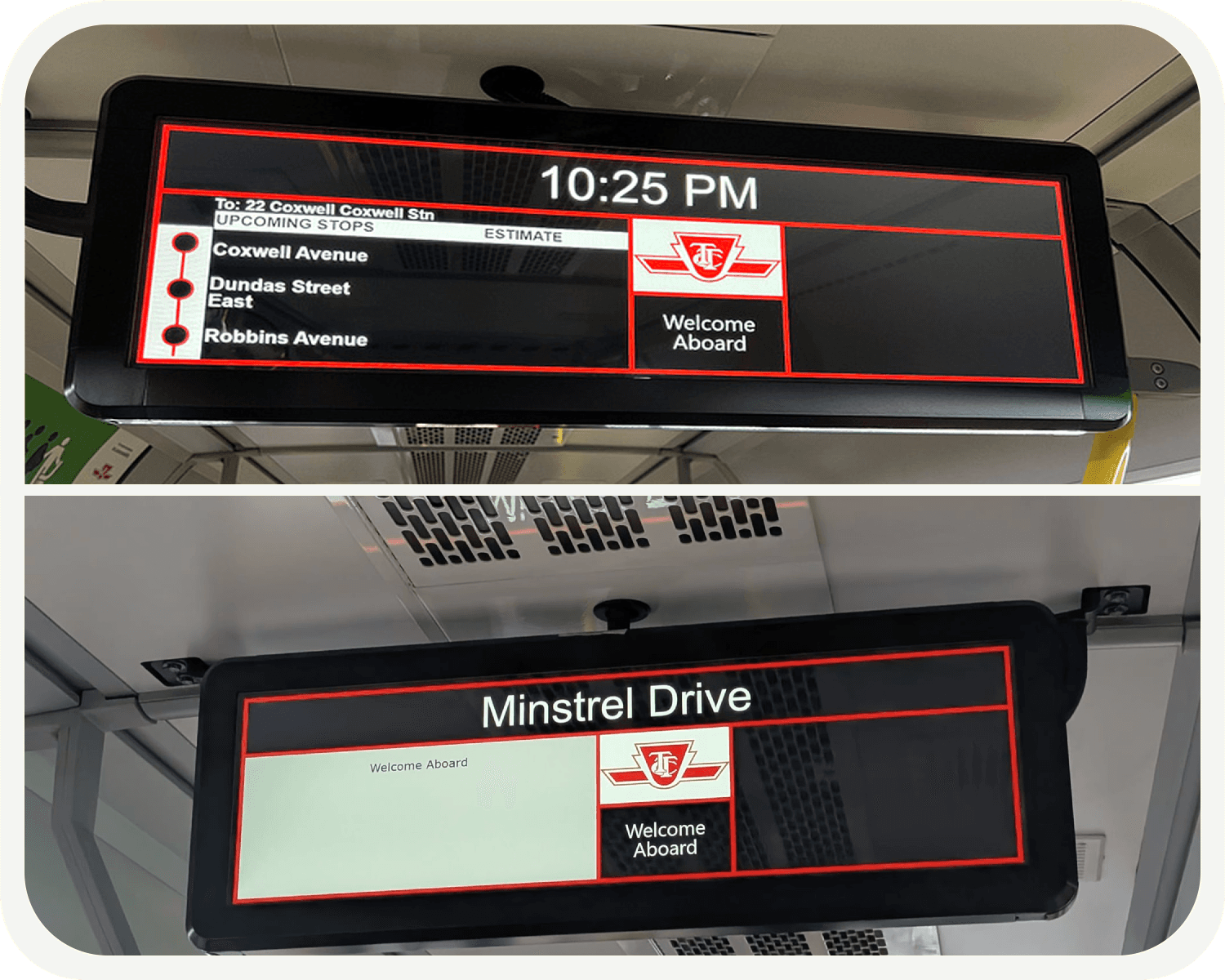
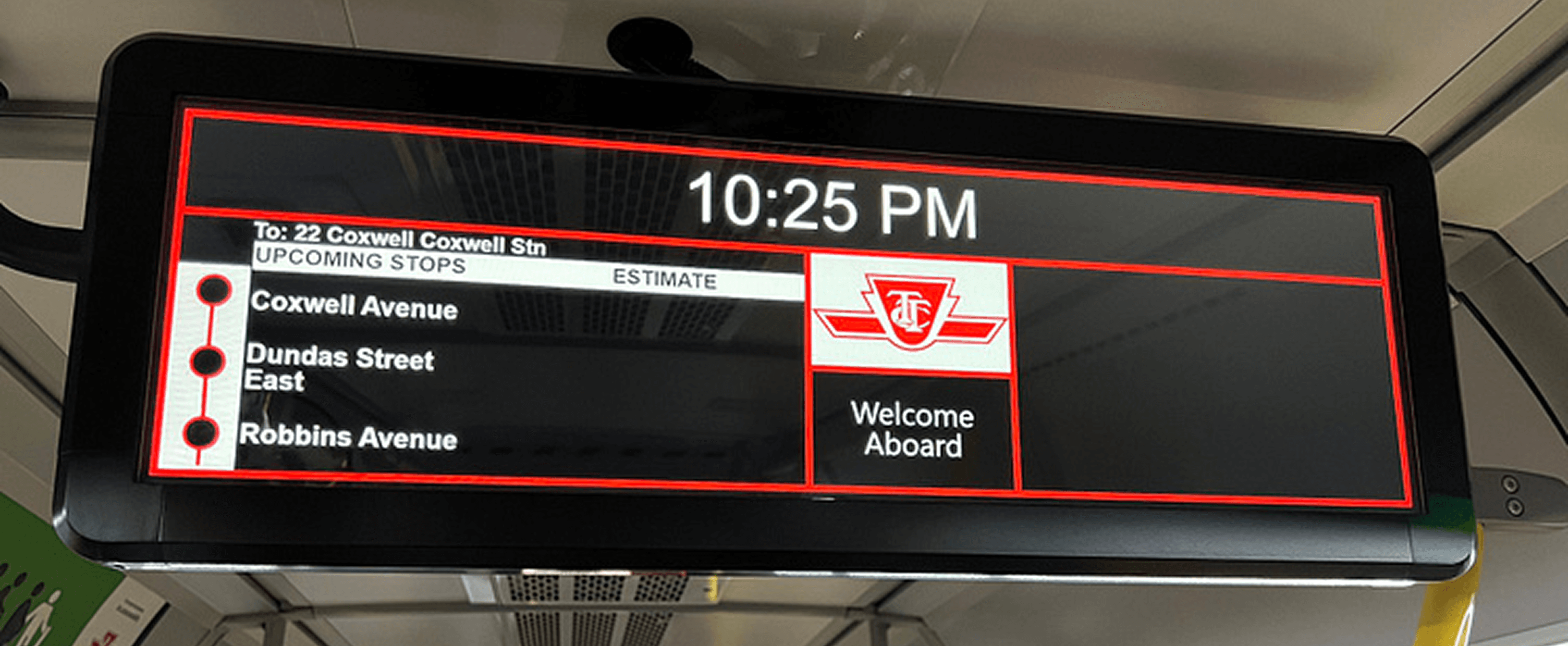
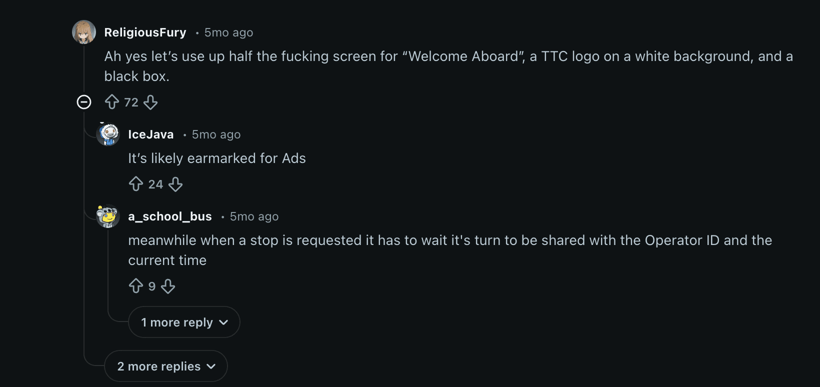
The idea came from standing on a packed TTC bus, staring at the on-board screen, and realizing it wasn’t actually helping. From personal experience, conversations, and countless Reddit threads, it became clear the display is outdated and wastes valuable screen real-estate while riders are left guessing.
For new riders and tourists, this often causes unnecessary panic resulting in missed stops, rushed transfers, and a heavy reliance on Google Maps just to feel confident.
Stop Requested?
Next Stop ETA?
Bus Transfer Options?
Map? Destination?
Stop Requested?
Next Stop ETA?
Bus Transfer Options?
Map? Destination?
The Why, The What, & The How?
Questioning that resulted in project selection.
Project Selection Questioning
🛞
🛞
🛞
Why do we need a redesign in the first place?
Why do we need a redesign in the first place?
Why has the TTC not taken any initiatives to update the design even after so many blogs, subreddits and backlash from the TA?
Why has the TTC not taken any initiatives to update the design even after so many blogs, subreddits and backlash from the TA?
What if we had a live map?
What if we had a live map?
What if we promptly showed the “stop requested” sign for instant user acknowledgement?
What if we promptly showed the “stop requested” sign for instant user acknowledgement?
What if we could show connecting transits and their wait times?
What if we could show connecting transits and their wait times?
What if we showed temperature and current time?
What if we showed temperature and current time?
How can I redesign the display so that it encompasses all of the above mentioned solutions but at the same time doesn’t seem cluttered or the user doesn’t get confused with information overload?
How can I redesign the display so that it encompasses all of the above mentioned solutions but at the same time doesn’t seem cluttered or the user doesn’t get confused with information overload?

Stop Requested sign transitions into time every few secs

Transits in the EU show live weather, transfers, and ETA

NYC transit shows a live map

Because of all the backlash by the end users
Stop Requested sign transitions into time every few secs
Transits in the EU show live weather, transfers, and ETA
NYC transit shows a live map
Because of all the backlash by the end users
Sections That Made Users Go "MOTHER--#@%#"
The pain points in detail.
🛞
🛞
🛞
What are transfers and why are they important?
Pain Point
Most TTC riders rely on multiple bus transfers to reach their destination. In freezing cold temperatures, waiting outside isn’t just inconvenient, it’s uncomfortable. Riders need to know the ETA of their next transfer bus before getting off as they usually have multiple transfer stop choices, so they can choose the right stop and minimize time spent in the cold.
Why Does It Matter?
By displaying transfer ETAs onboard, TTC empowers riders to make informed decisions. Thereby, turning uncertainty into confidence and improving overall trust in the transit experience.
What are transfers and why are they important?
Pain Point
Most TTC riders rely on multiple bus transfers to reach their destination. In freezing cold temperatures, waiting outside isn’t just inconvenient, it’s uncomfortable. Riders need to know the ETA of their next transfer bus before getting off as they usually have multiple transfer stop choices, so they can choose the right stop and minimize time spent in the cold.
Why Does It Matter?
By displaying transfer ETAs onboard, TTC empowers riders to make informed decisions. Thereby, turning uncertainty into confidence and improving overall trust in the transit experience.
Googling, But Professionally
secondary research.
🛞
🛞
🛞
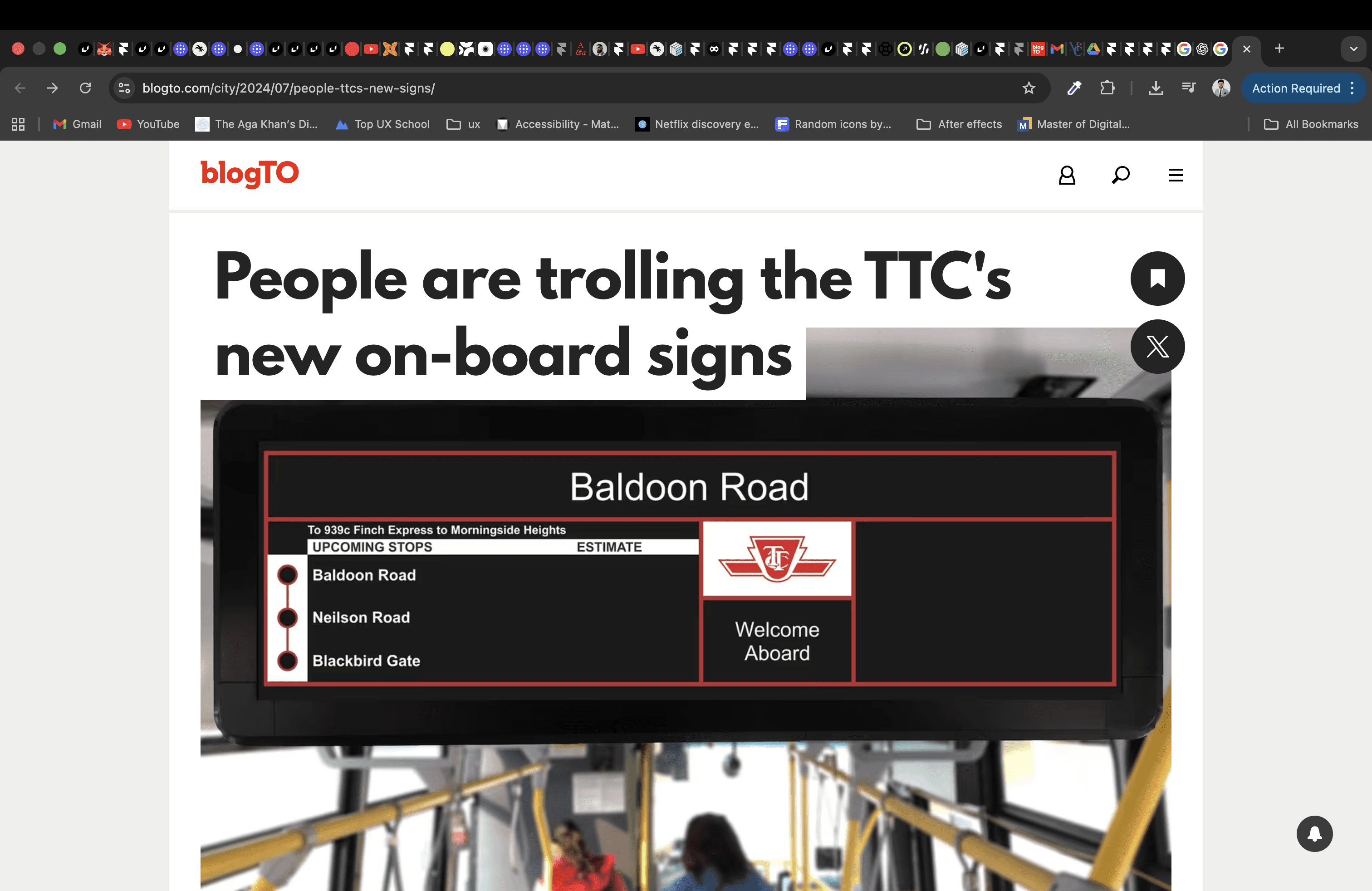
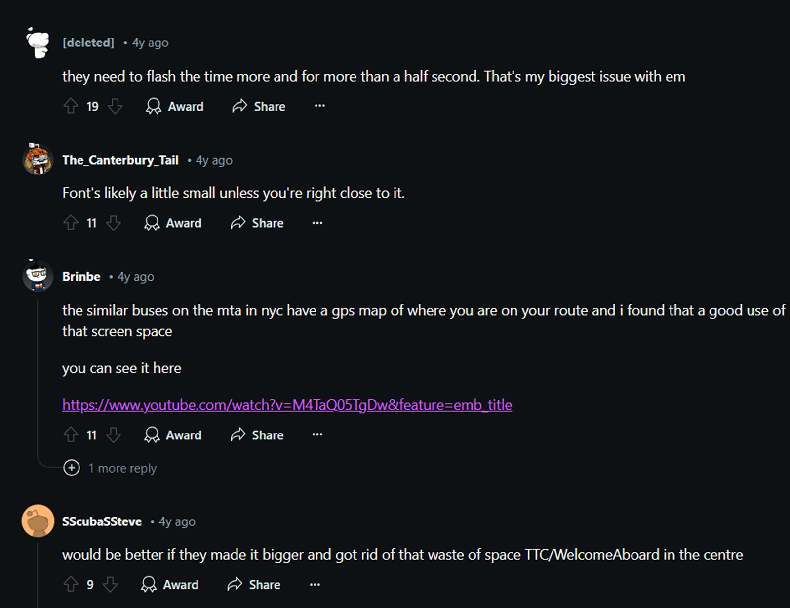
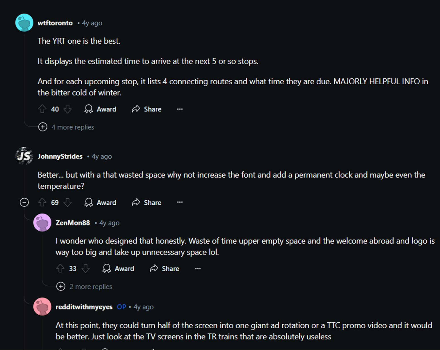
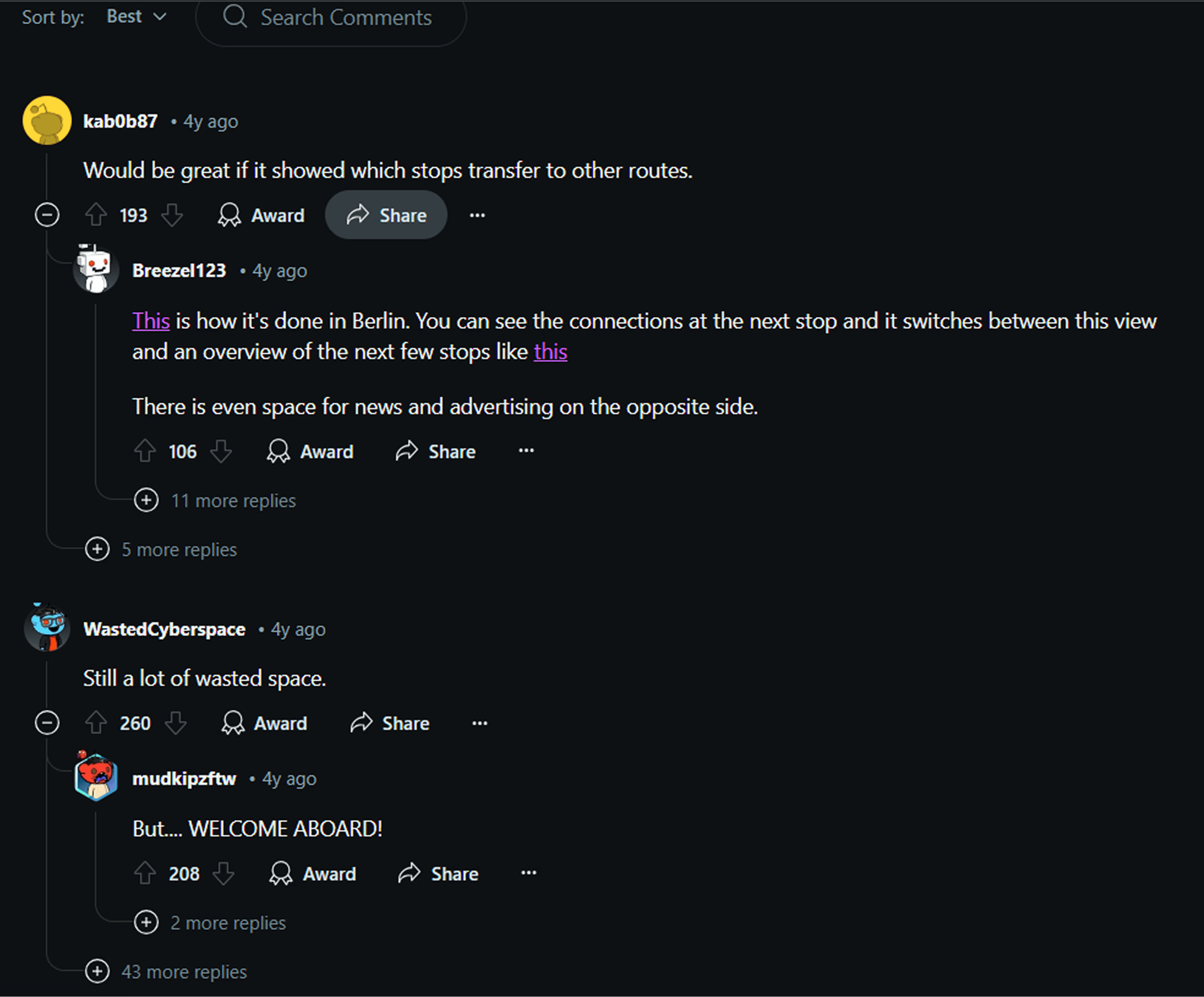
Iterations Based On Primary Research
wireframes & user tests.
🛞
🛞
🛞
Hi-Fid
Low-Fid
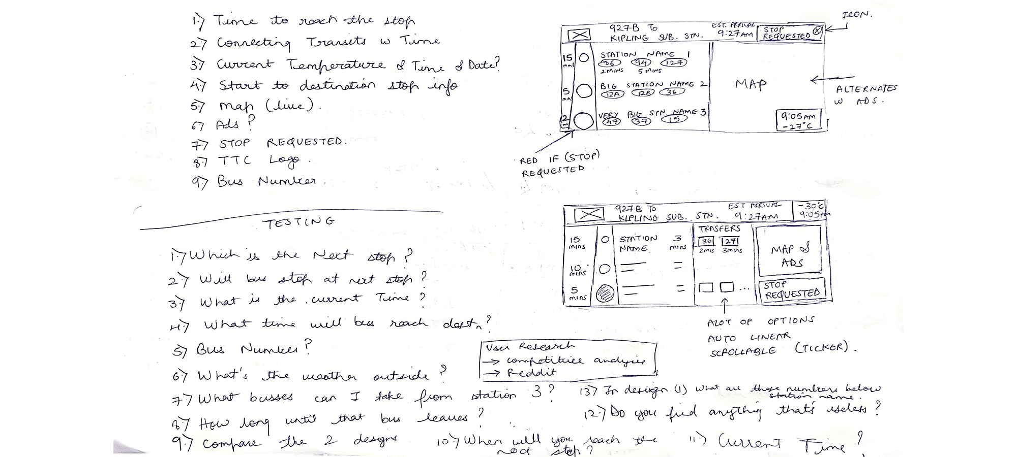
Sketches and user testing planning
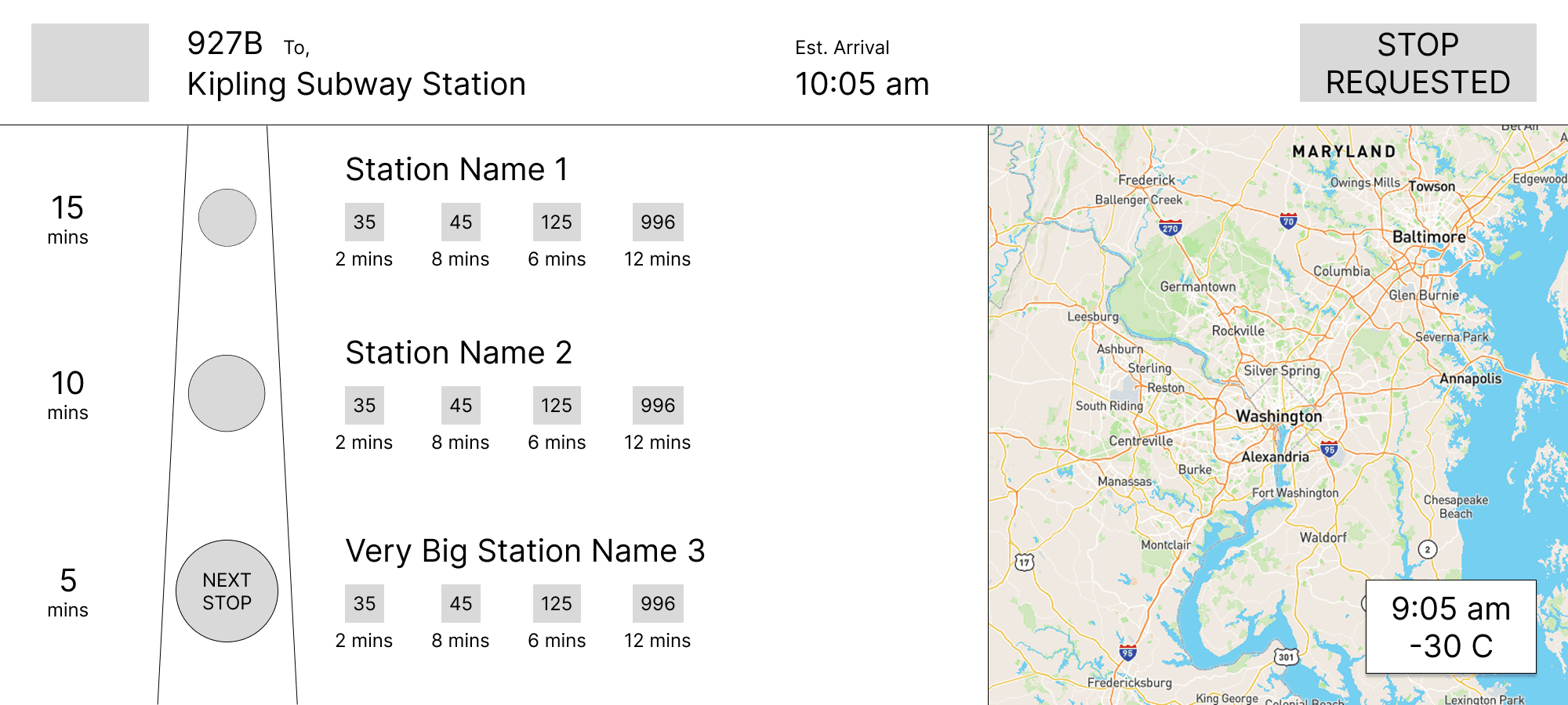
B. Stop requested on top and weather on map
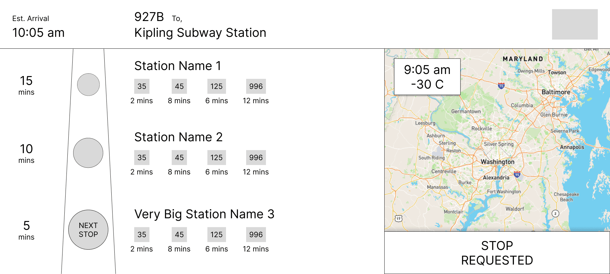
C. Stop requested on map & ETA on top left
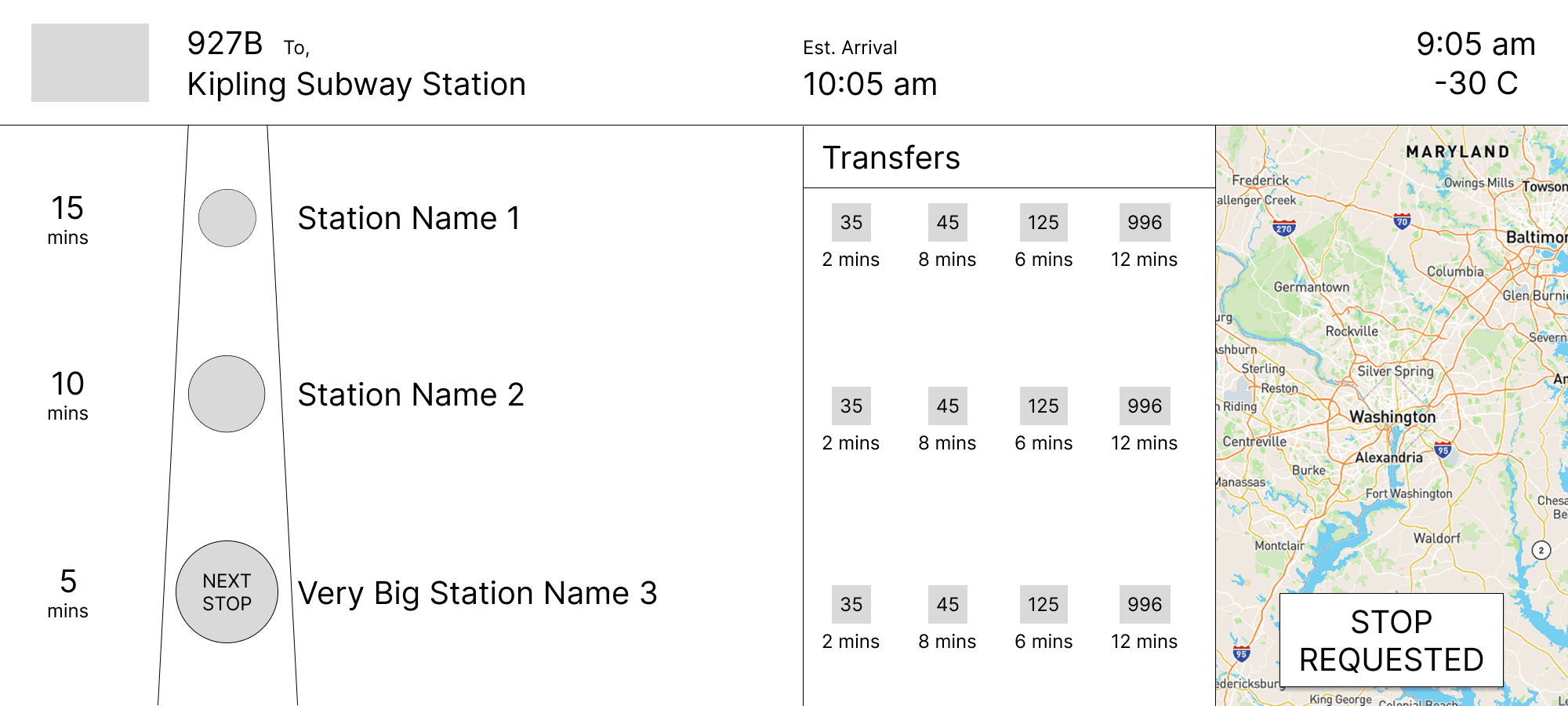
D. Different transfers section
Hi-Fid
Low-Fid
Sketches and user testing planning
C. Stop requested on map & ETA on top left
B. Stop requested on top and weather on map
D. Different transfers section
Hi-Fid
Low-Fid
Sketches and user testing planning
C. Stop requested on map & ETA on top left
B. Stop requested on top and weather on map
D. Different transfers section
Research Backed
Potential solutions.
🛞
🛞
🛞
Design Rationale
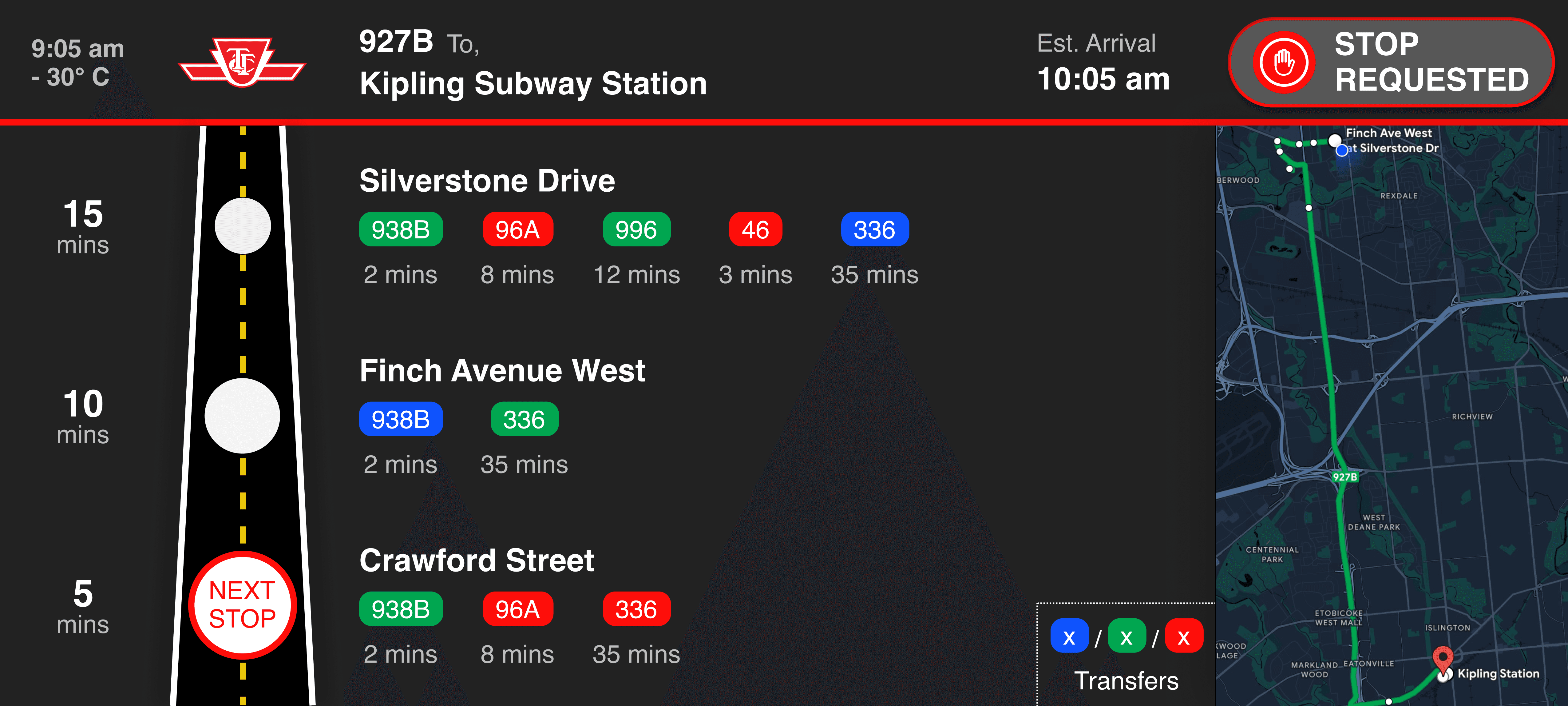
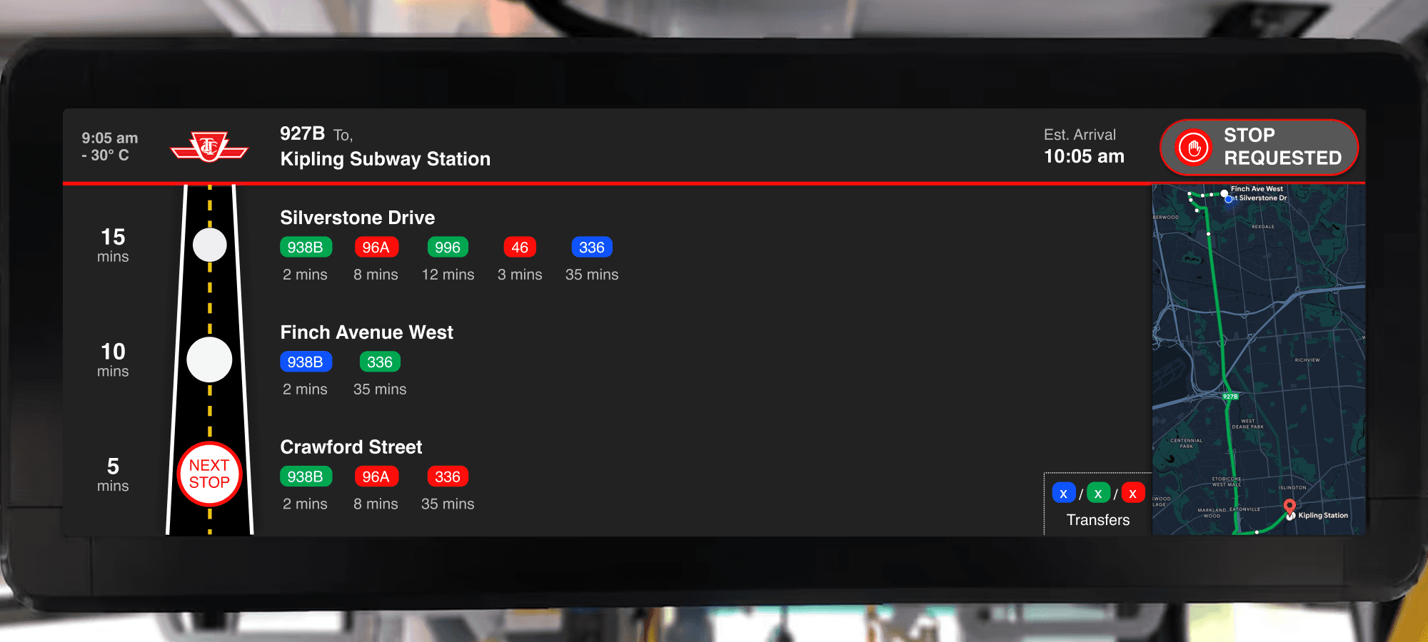
A road illustration has been used to indicate next stops and their ETAs. Additionally, each stop name has all the possible transfer bus numbers and their ETAs. For eg. A rider can get off at Crawford street in 5 mins and from that stop the rider has the option to transfer to busses 938B, 96A, and 336 which would come in the next 2 mins, 8 mins, and 35 mins respectively. This section has a lot of space in the layout since long stop names and more transfer options were taken into account.
Design Rationale
A road illustration has been used to indicate next stops and their ETAs. Additionally, each stop name has all the possible transfer bus numbers and their ETAs. For eg. A rider can get off at Crawford street in 5 mins and from that stop the rider has the option to transfer to busses 938B, 96A, and 336 which would come in the next 2 mins, 8 mins, and 35 mins respectively. This section has a lot of space in the layout since long stop names and more transfer options were taken into account.
Drag The Slider Below
The Comparison.
🛞
🛞
🛞
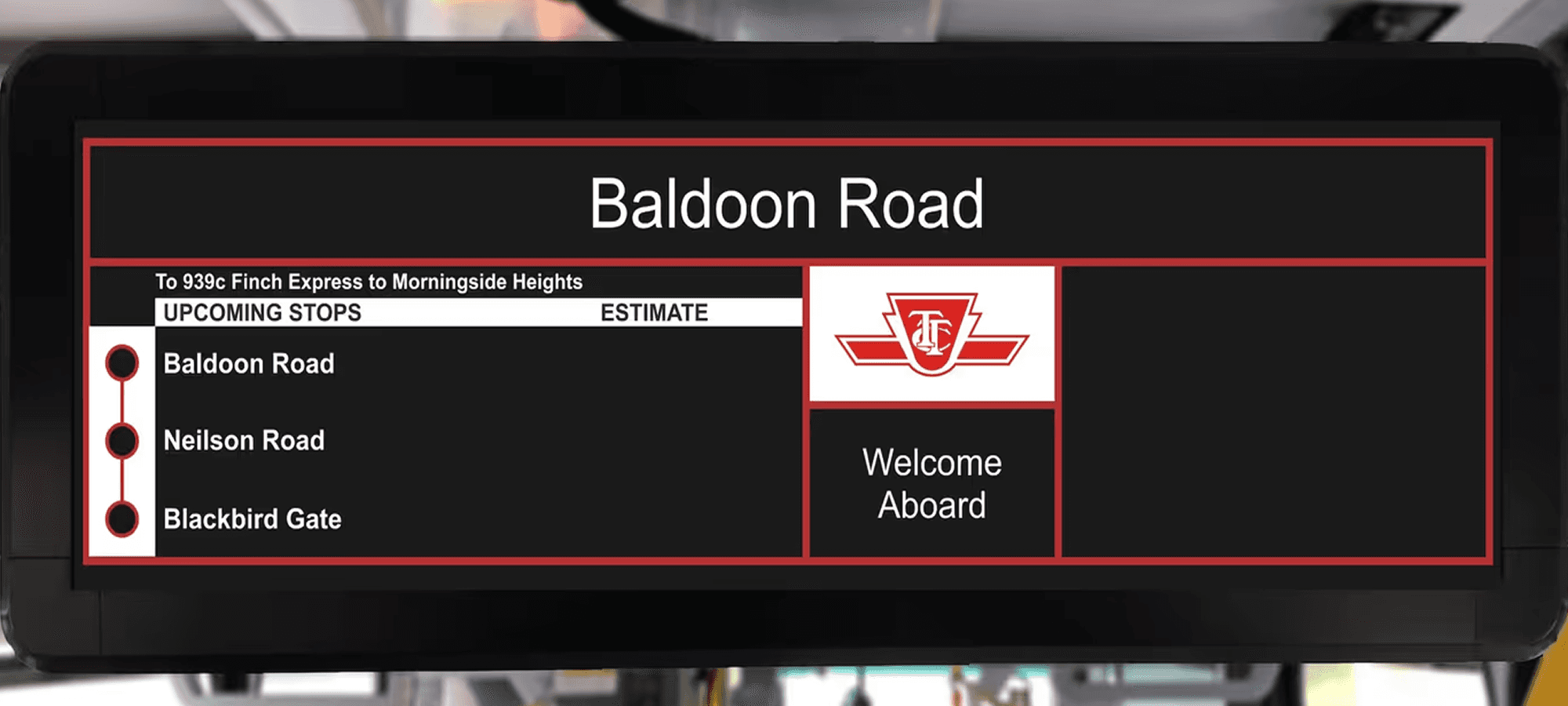
Old Design
Old Design
New Design
New Design

Designed on a 100 sleepless nights with ❤️, logic, and a lot of ☕️
Copyright © 2026 Adnaan Lalani.
All Rights Reserved.
UX DESIGN
❖
UX RESEARCH
❖
UI DESIGN
❖
PRODUCT DESIGN
❖
DESIGN AUDIT
❖
ZERO UI
❖
DAM DESIGN
❖
IA DESIGN
❖
EXPERIENCE DESIGN
❖
HUMAN CENTRED
❖
MICRO INTERACTIONS DESIGN
❖
BIAS FREE RESEARCH
❖
5 YEARS OF EXPERIENCE
❖
AI EMBEDDED DESIGN WORKFLOWS
❖
FRONT END DEV
❖
DATABASE DESIGN
❖
STORYTELLER
❖
VIBE CODE
❖
Designed on a 100 nights with ❤️, logic, and a lot of ☕️
Copyright © 2026 Adnaan Lalani.
All Rights Reserved.
UX DESIGN
❖
UX RESEARCH
❖
UI DESIGN
❖
PRODUCT DESIGN
❖
DESIGN AUDIT
❖
ZERO UI
❖
DAM DESIGN
❖
IA DESIGN
❖
EXPERIENCE DESIGN
❖
HUMAN CENTRED
❖
MICRO INTERACTIONS DESIGN
❖
BIAS FREE RESEARCH
❖
5 YEARS OF EXPERIENCE
❖
AI EMBEDDED DESIGN WORKFLOWS
❖
FRONT END DEV
❖
DATABASE DESIGN
❖
STORYTELLER
❖
VIBE CODE
❖
Designed on a 100 sleepless nights with ❤️, logic, and a lot of ☕️
Copyright © 2026 Adnaan Lalani.
All Rights Reserved.
UX DESIGN
❖
UX RESEARCH
❖
UI DESIGN
❖
PRODUCT DESIGN
❖
DESIGN AUDIT
❖
ZERO UI
❖
DAM DESIGN
❖
IA DESIGN
❖
EXPERIENCE DESIGN
❖
HUMAN CENTRED
❖
MICRO INTERACTIONS DESIGN
❖
BIAS FREE RESEARCH
❖
5 YEARS OF EXPERIENCE
❖
AI EMBEDDED DESIGN WORKFLOWS
❖
FRONT END DEV
❖
DATABASE DESIGN
❖
STORYTELLER
❖
VIBE CODE
❖